
Learn to create a Lettering Cut Paper Effect in Procreate in 10 simple and detailed steps. You will also find bonus tips and tricks to ease out the process for you. Let’s dive in!
Date: 30th of March 2020
Est Read Time: 8 min.
Looking for a simple method to create an awesome paper cut effect in Procreate? If yes, then this tutorial is for you. Creating these effects and textures can look super tricky but today, we have broken down the process into very simple steps.
For this tutorial, we have used our latest brush set The Ultimate Procreate Background Set but you can follow along the tutorial using our brushes and textures from the Free Treasury which comes with a lot of other exciting freebies.
Learn to create a Lettering Cut Paper Effect in Procreate in 10 simple and detailed steps. You will also find bonus tips and tricks to ease out the process for you. Let’s dive in!
TOOLS TO START THIS TUTORIAL
- iPad Pro (You can use any iPad as long as it supports the Procreate App)
- Procreate Software
- Apple Pencil (or any other compatible stylus)
- The Ultimate Procreate Background Set
PS. If you don’t have our latest product “The Ultimate Procreate Background Set”, try out the Free Sample Set in our Freebie Treasury available for our awesome community newsletter subscribers.
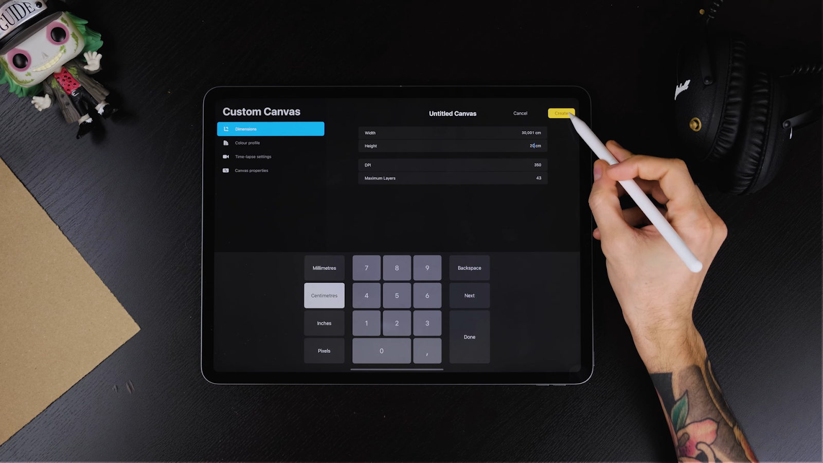
STEP 1: CREATE A NEW DOCUMENT
- Begin by creating a new document.
- For this tutorial, we are using a horizontal 20x30 centimeters canvas with 350 DPI.
This DPI allows us to get a high quality print in the future.
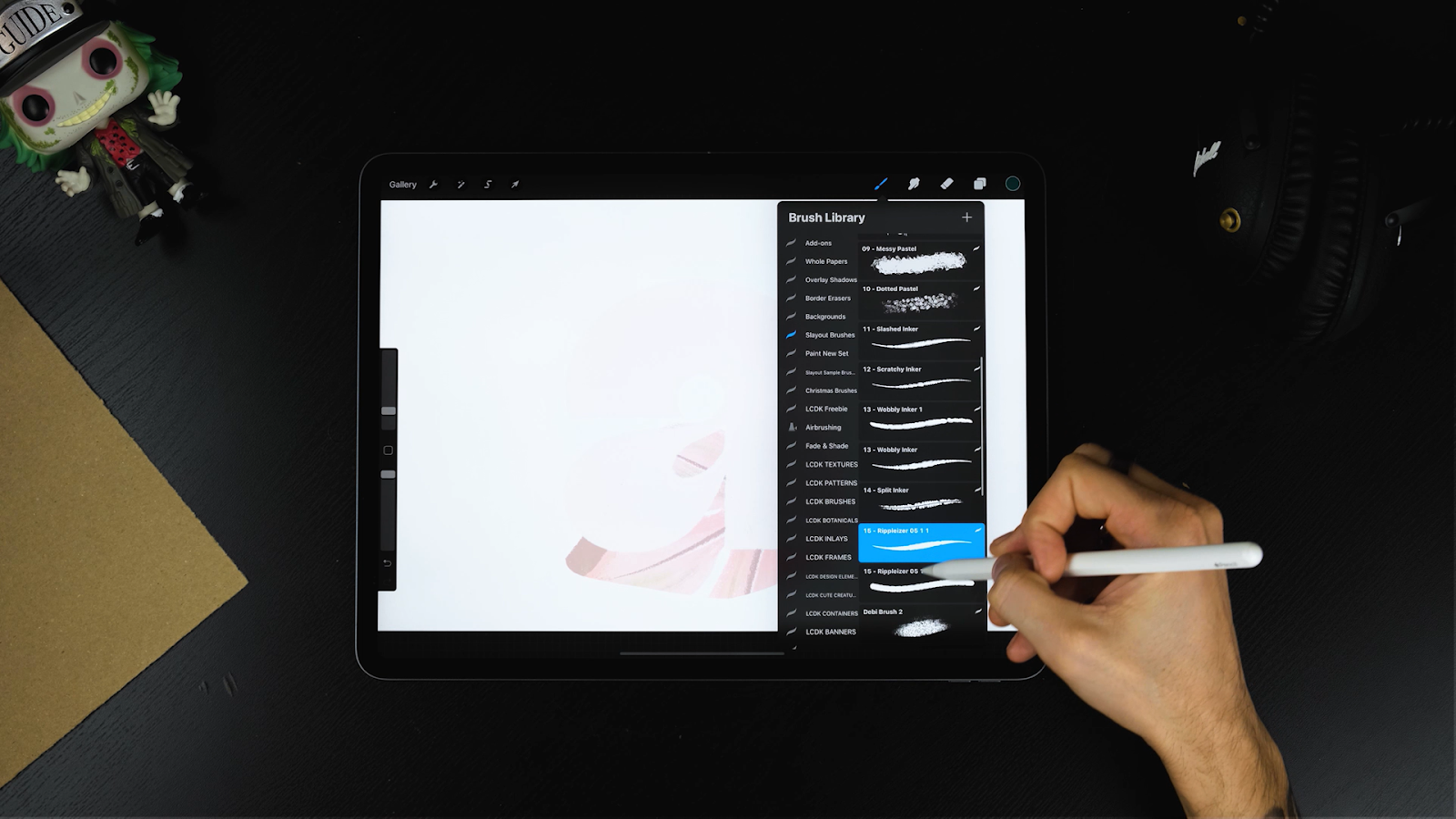
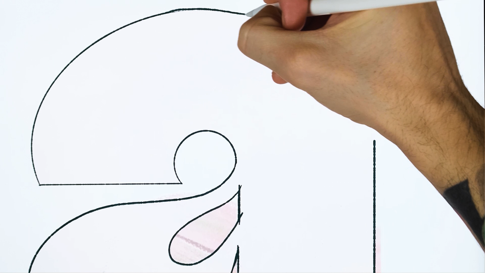
STEP 2: DRAW A LETTER
- Choose from any letters you have created previously to save time instead of creating a new letter. For this tutorial, I chose a letter I created for Christmas.
- To increase the size of this pre-designed letter, lower the opacity of the letter.
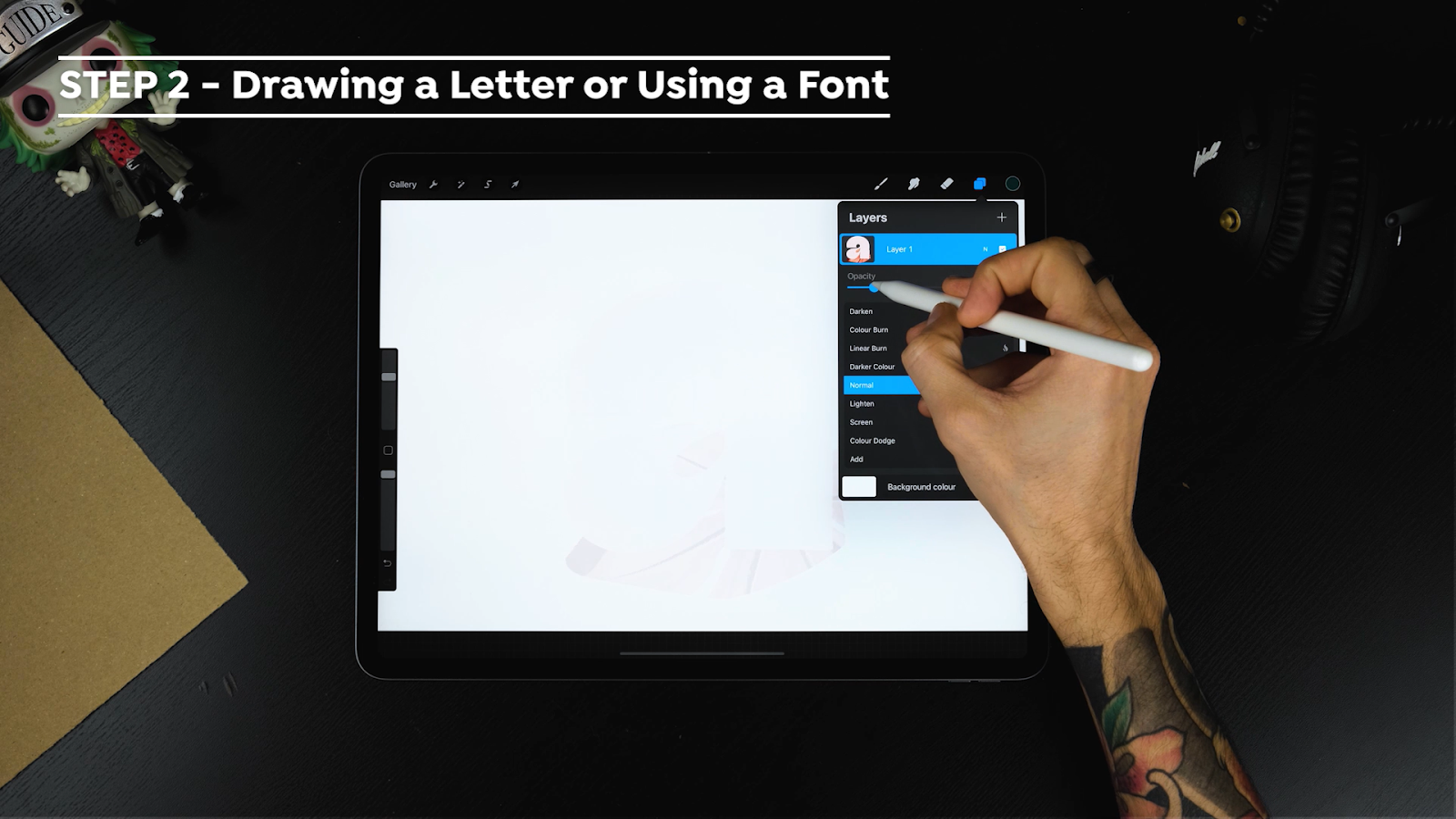
- Redraw an outline for the letter on a new layer using the Rippleizer brush (you can use any native brush you feel comfortable with).
- After the letter is drawn, add the color green (any other color of your choice) to the letter.

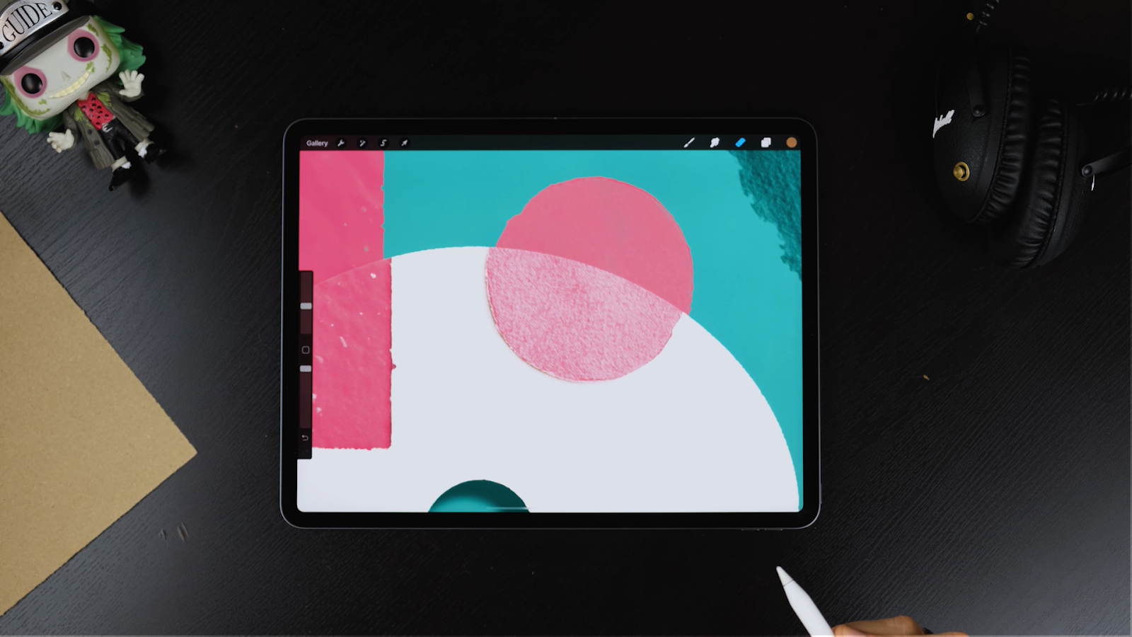
STEP 3: STAMP RIPPED PAPERS
- Once the letter is correctly places, choose another color (doesn’t matter which one at this stage)
- Open the Ultimate Background Set. If you just have the Sample set you can use the stamps “Crafty Paper 3 and Watercolor Banner. If you got the complete set you will find a total of 36 ripped papers.

- Create a new layer for each individual stamp
- Fill your canvas with the stamps.
- Keep stamping until you’re satisfied with the amount of elements on the canvas.
Some similar colored shapes may overlap, so to make them visible, add a different color to make those shapes visible.
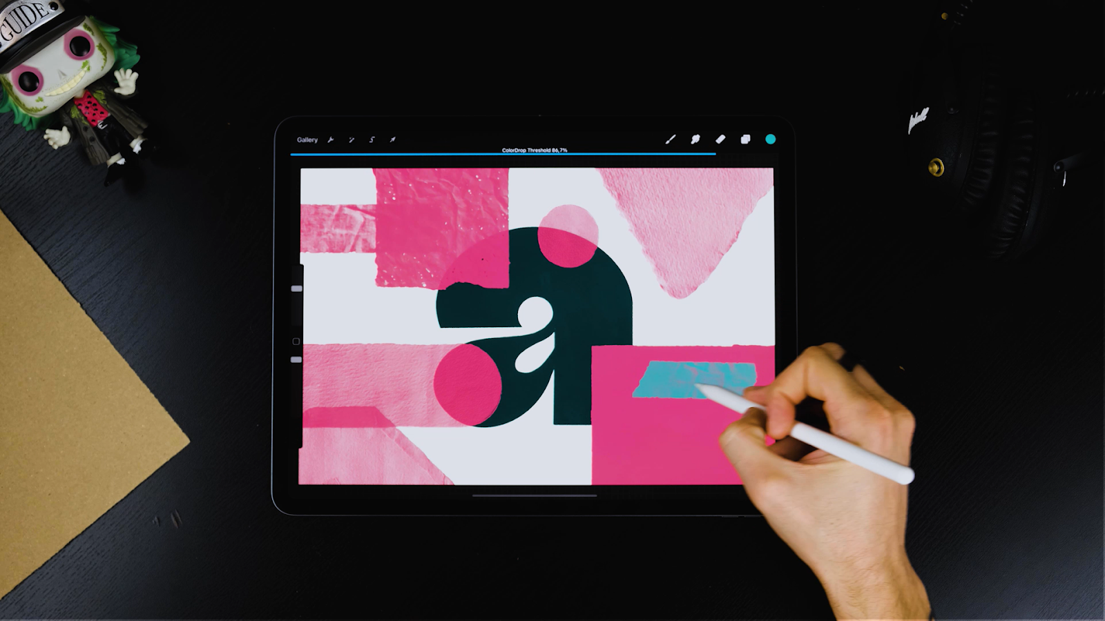
STEP 4: RECOLOR YOUR PIECE
Change the colors of the whole piece:
- Pick a palette that has a limited number of colors to find a good balance
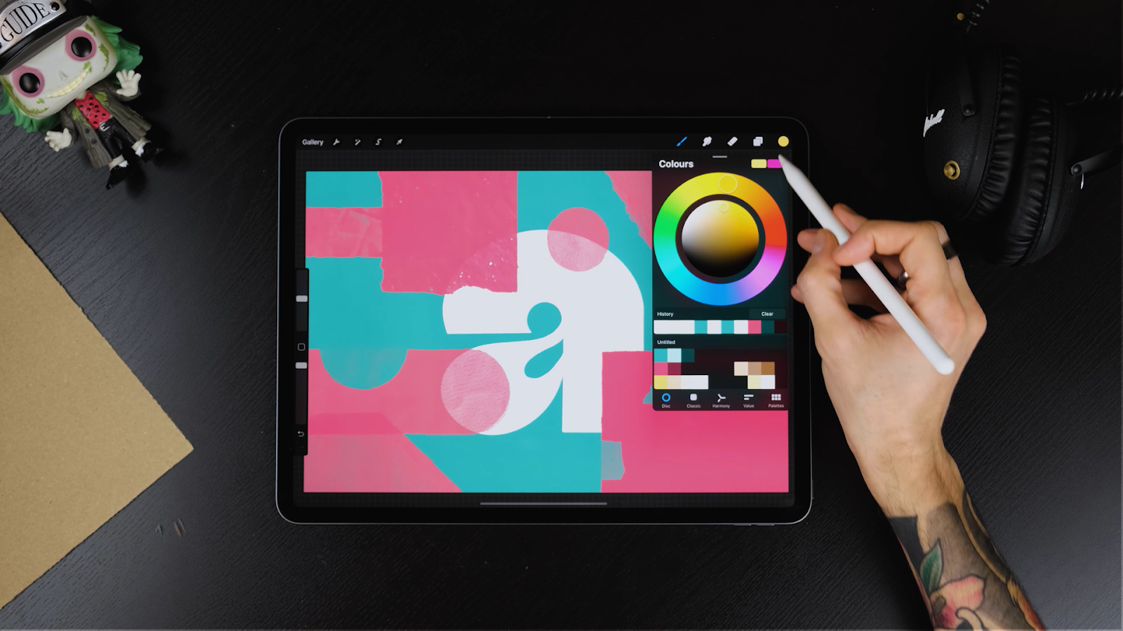
- Start by changing the background color.
- Next, add a contrasting color to the other elements.
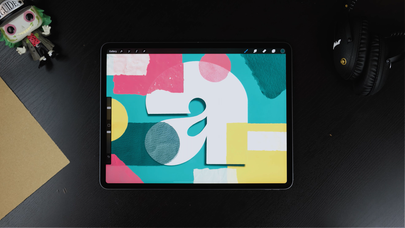
This completes the main composition.
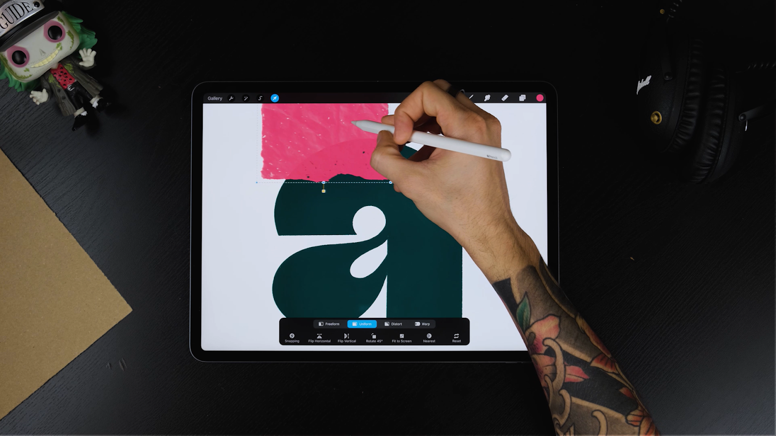
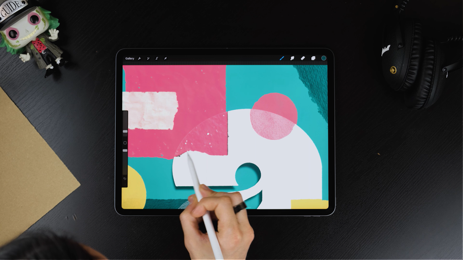
STEP 5: REARRANGE THE ELEMENTS
Let’s add some effects.
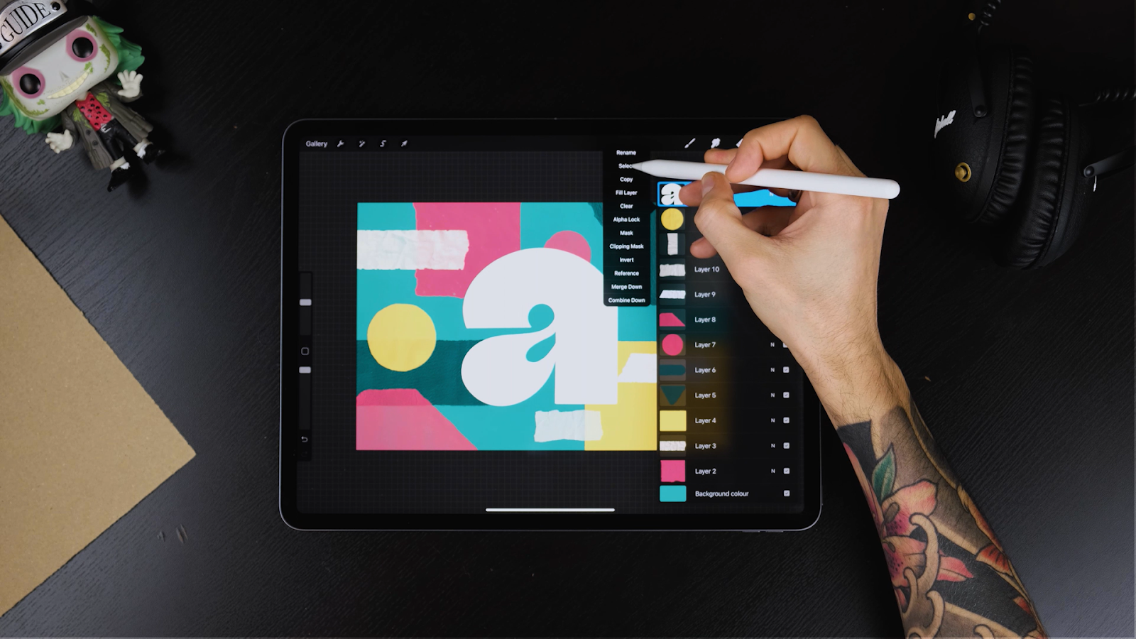
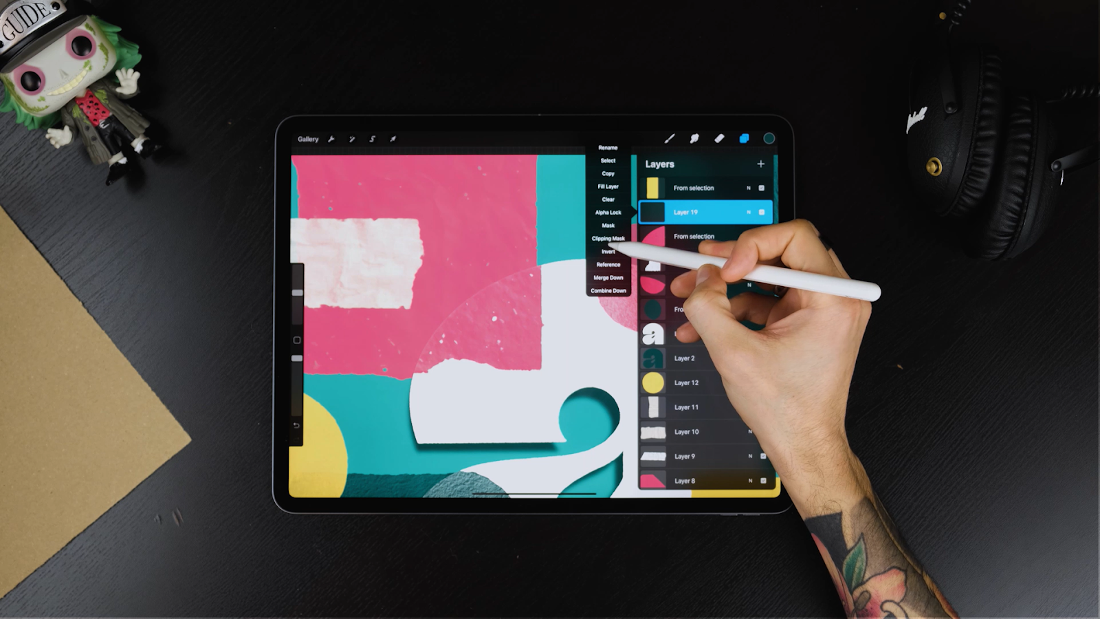
- Select the letter layer and bring it to the top.
- Tap on the letter layer and choose “Select” from the menu.
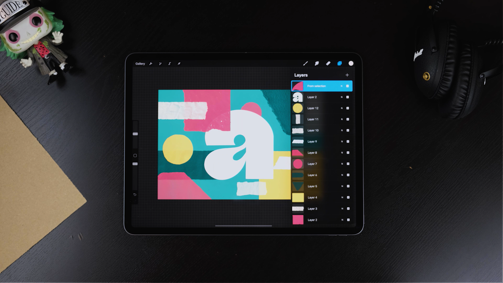
- Next, select the shape that touches the letter, scroll down using three fingers and tap on Duplicate.
- Bring the new layer on top of the letter layer.
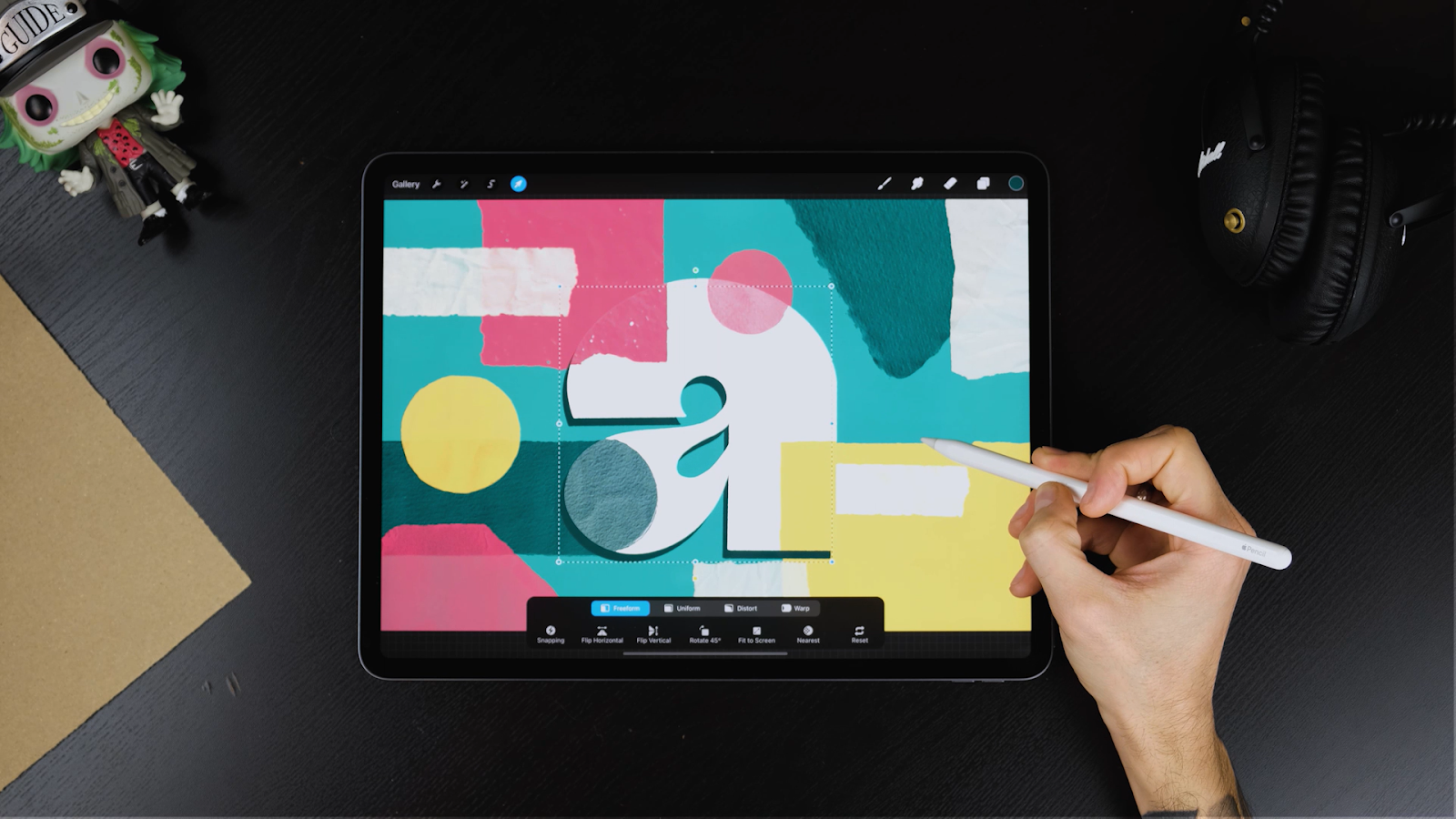
Repeat the same steps for all the stamps touching the letter. Select the shapes you duplicated previously and move them slightly to give an offset effect and more dimension. Feel free to play around with the size of the shapes.

STEP 6: CHOOSE THE LIGHT DIRECTION
- Choose the direction of the light as it will define the shadows and other important aspects of the design.
- Duplicate the letter layer and drop a darker color on the bottom layer.
Move the bottom letter based on the light direction you chose. For this tutorial, the light is coming from the top-right corner.
- Head to the Adjustments panel and choose Gaussian Blur. Once selected, adjust the amount of blur by moving your pencil right and left on the screen. The more blur you add, the further the letter will seem from the background. In this case, we chose to have it close to the background, so we added a 6% gaussian blur.
- Tap on Transform and select Distort. Use the corners of the selection to adjust the shadows irregularly.
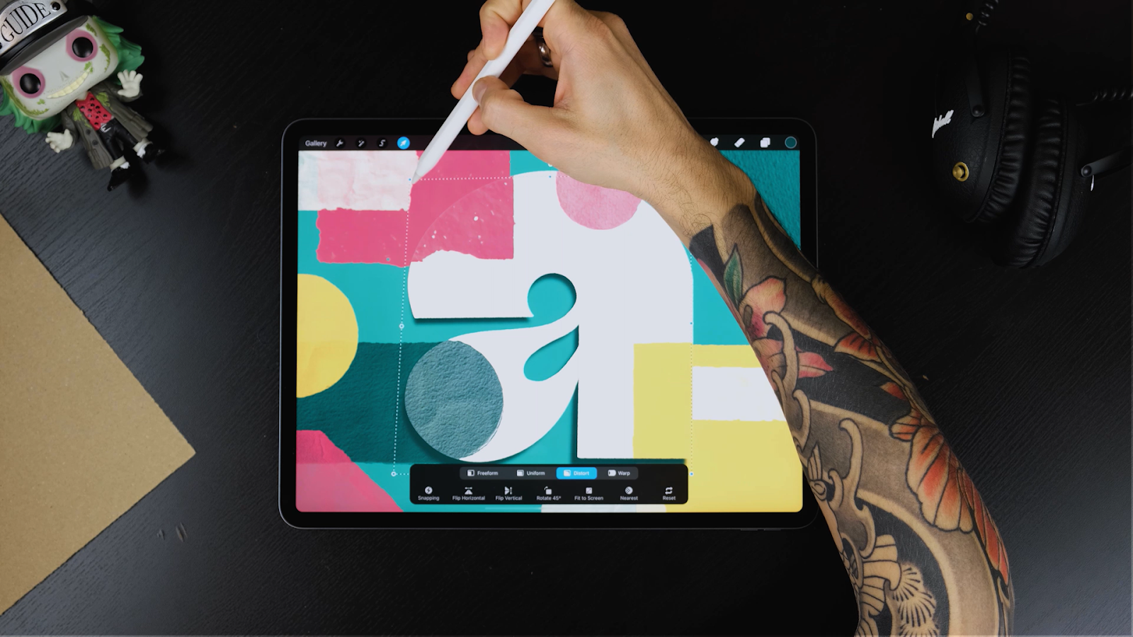
This adds realism to the piece and doesn’t look parallel to the background.
STEP 6: ADD SHADOWS
- Choose which elements should go at the button and on top.
- For example, the red piece as shown in the image below looks like it is cutting the letter, so the letter projects some shadow on it. We will try to add that effect now.
- Go to the payers panel, create a new layer on top of the red element that’s cutting the letter and create a Clipping Mask so the shadows only affect the layer underneath.
- Choose the Inverted Texture Brush to create the shadows.
- In the The Ultimate Procreate Background Set, each texture comes with an inverted texture brush that works perfectly as a shader.
Pro Tip: If you haven’t got the brush set yet, download the freebie and convert textures into shaders. For example, select “Fabric Like” by tapping on the brush, go to Grain, edit by tapping with two fingers on the texture and clicking Done. Now your shader is ready to add some awesome shadows.

Now, let’s be a little imaginative.
- Spray some shadows accordingly to your light source.
- For this tutorial, the overall shadows will be mild so it looks like the paper cuts are almost touching.
- Repeat the same steps for all the ripped papers.
- Select the shape on the background, creating a clipping mask and spraying some shadows but this time coming from the letter.
Pro Tip: The shadows should always be darker than the cut papers but when we add shadows on lighter papers the shadows should be following the tones of them. For example, in this tutorial our letter is semi-white, so the shadows would be brownish. If you have a red surface, the shadows should be a dark red tone and so on.
- Since some of these papers have some level of transparency, shadows will be shown through them. To avoid this, paint your shadows and then select the paper on top.
- Click on the selection tool and select Automatic on the bottom.
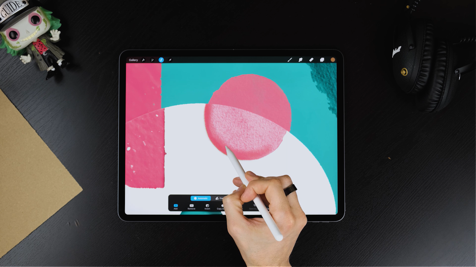
- Next, tap inside your selected shape and move your pencil right and left until you have a good selection.
- Head back to your shadow, scroll three fingers down and tap on Cut.
This ensures that shadow doesn’t show through at unwanted places. Play around with some colors and shadows.

Pro Tip: When your shadows are on top of 2 papers at the same time there’s no need to do a clipping mask on each one of them. Just create a new layer under the shape projecting the shadows, and set your layer to multiply by tapping on that little letter N on each layer. Multiply will make the color of your shadow affect differently on each color that’s painted on. So, your shadow will look realistic on both papers. Also, if you feel the paper transparency is not showing their color properly, you can always duplicate them and join them with a pinch. This way the colors will look more vibrant.
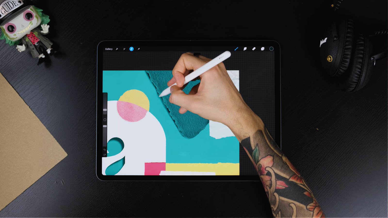
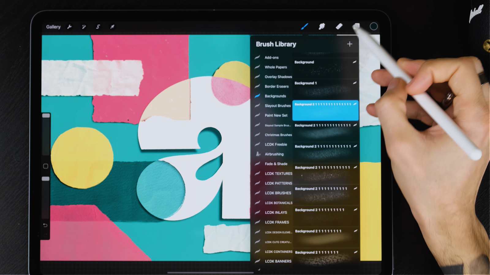
STEP 8: USE THE ULTIMATE BACKGROUND TEXTURES TO ADD TEXTURES
Let’s add some textures to bring out the WOW factor in the design.
The stamp papers are already textured but we can add textures on our letter and background to make them more realistic.
- Select any paper textures you like included in the The Ultimate Background Textures Set or the Freebie Treasure Box. It’s super simple to apply the textures since they are designed to be seamless.
- Create a clipping mask on top of the surface you would like to paint on and start spraying.
- Play around with colours and even several textures at the same time. Just have fun with it.
Pro Tip: Experiment with the size of the grain of these brushes to bring out diversity in textures.
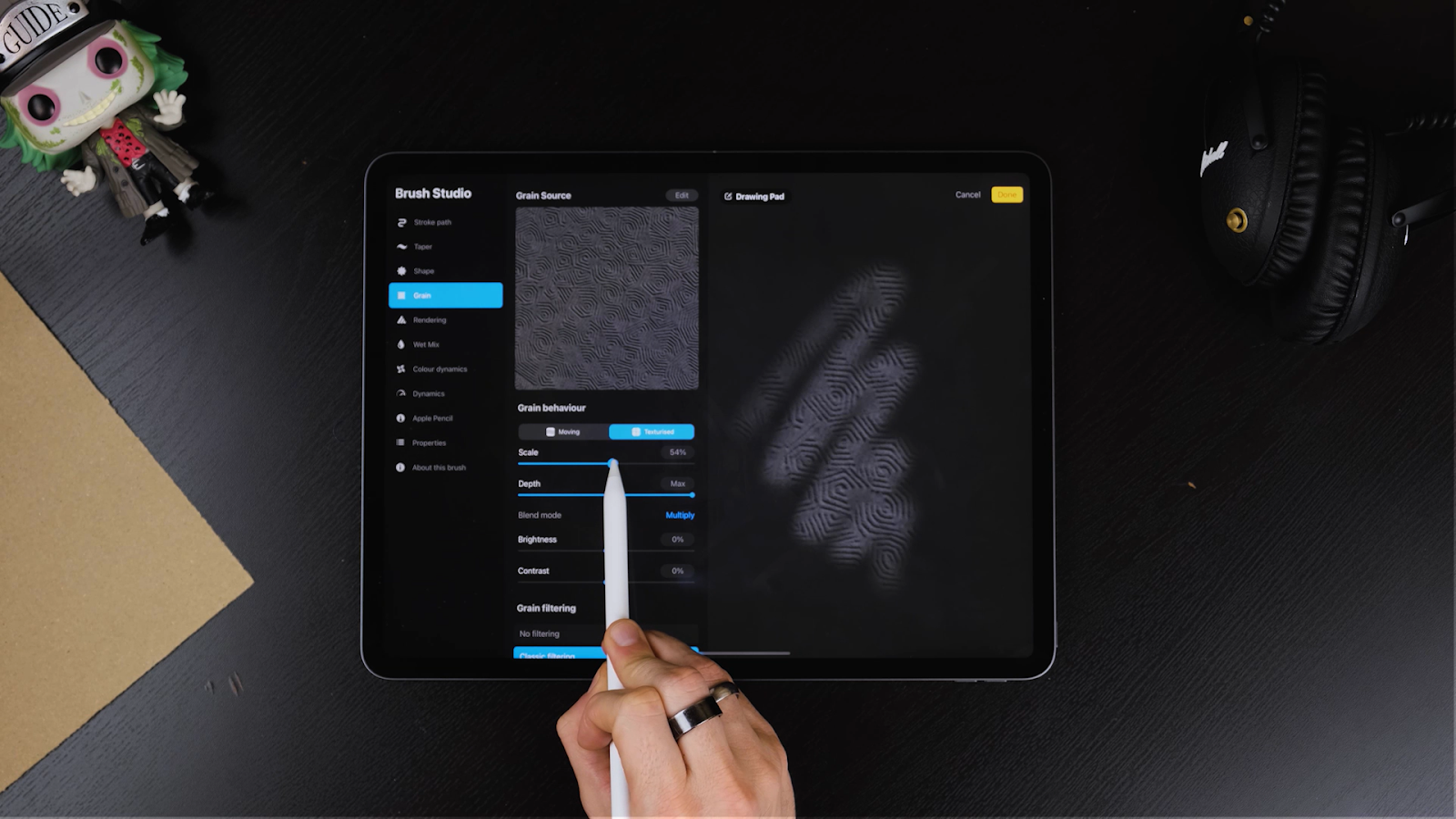
- For this tutorial, we are using the Pentagonal Embossed Brush and the little shapes in the texture looks way too small.
- To change this, tap on the brush inside the library.
- Once you enter the brush studio, go to “Grain” and change the scale.
- Once you’re satisfied click DONE.
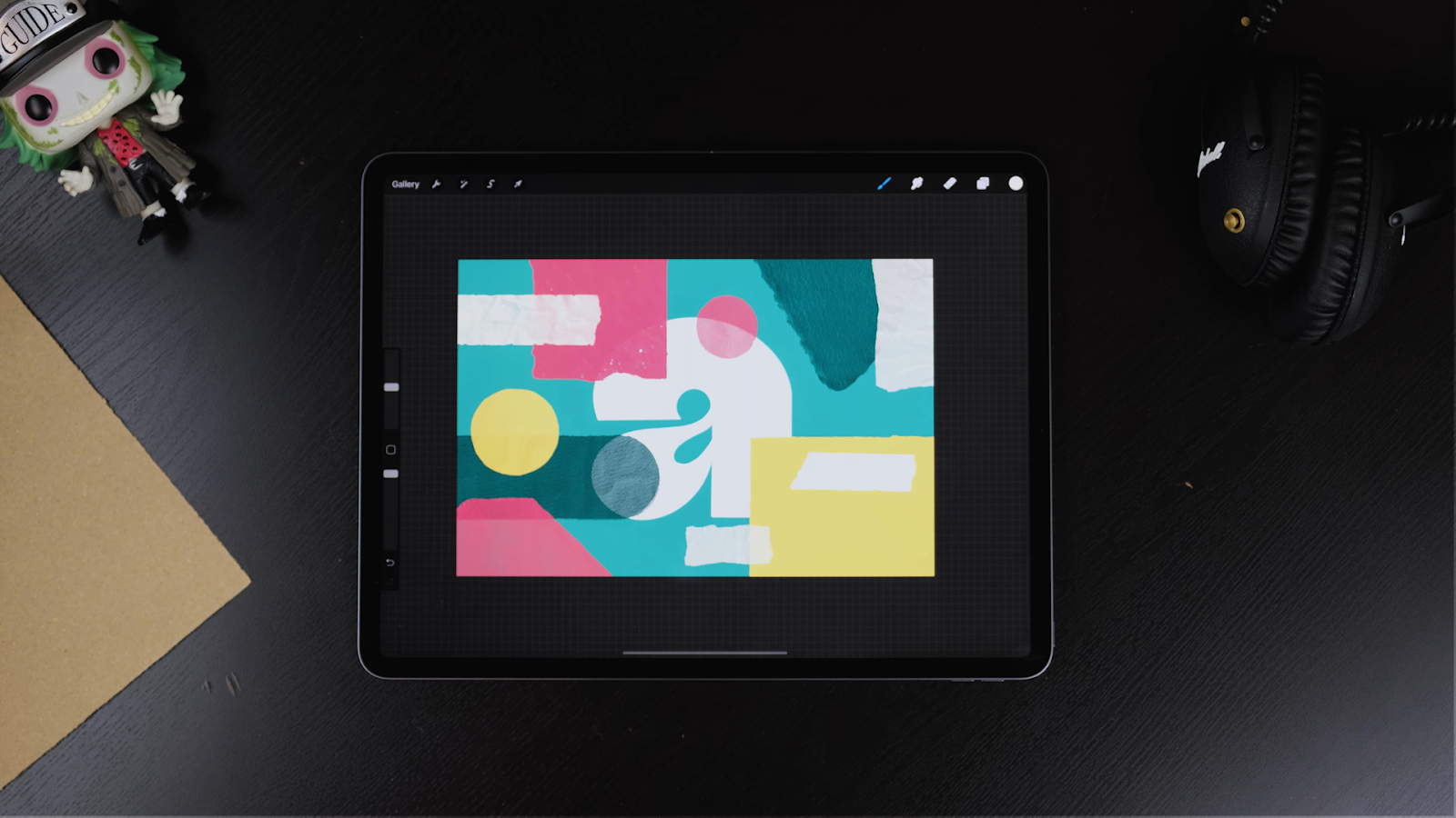
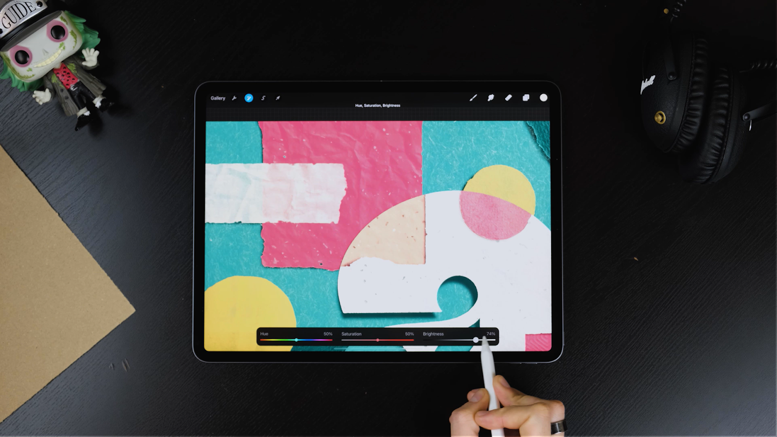
STEP 9: MAKE COLOR ADJUSTMENTS
- While you do the final textures, adjust some colours and tones.
- Some textures will tone down your original colours so if you’re not happy with them, select the coloured papers and go to the Adjustments panel.
- Now tap on Hue, Saturation, Brightness and adjust until you’re happy with the result.

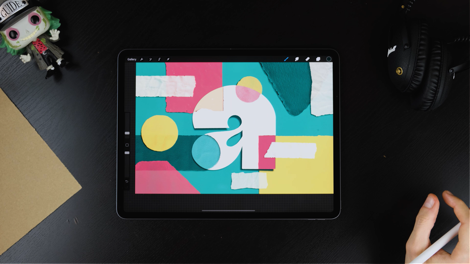
STEP 10: ADD OVERLAY SHADOWS
- For the final touches, stamp one of the Overlay Shadows included in the set. You can try them all out and see what fits your piece better.

- Add a new layer on top of everything else and make sure to position it where the light comes from.
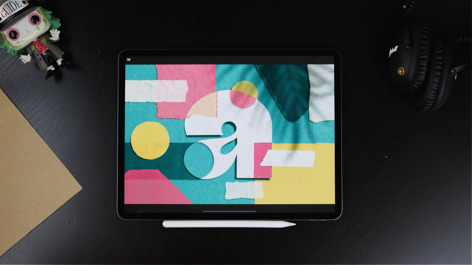
- Set it to multiply but feel free to try other modes! Also make sure you bring its opacity down if you don’t want it to be too visible.
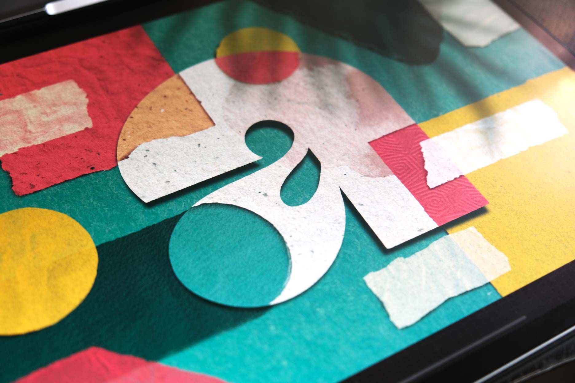
You are ready to create awesome designs and add Cut Paper Effect on any of your pieces.
If you want something a tad more advanced check our previous tutorial “9 Steps to Master Lettering Cut Paper Effect in Procreate (2021 Tutorial)“ where I’m teaching how to do a complete illustration with some of the techniques you’ve just learnt.
THE END!
We really hope you enjoyed this and that you made some beautiful illustrations. You can always leave a comment or reach out to us on Instagram @jimbobernaus if you want to leave feedback or tell us if you would like to learn something particular. We would love to help you out!
We wish you a spectacular day with a taste of creativity. And now - letter away!
Join our Newsletter Community, to get access to all of our freebies, including free Procreate Brushes, Textures, Fonts, and other fresh stuff!