
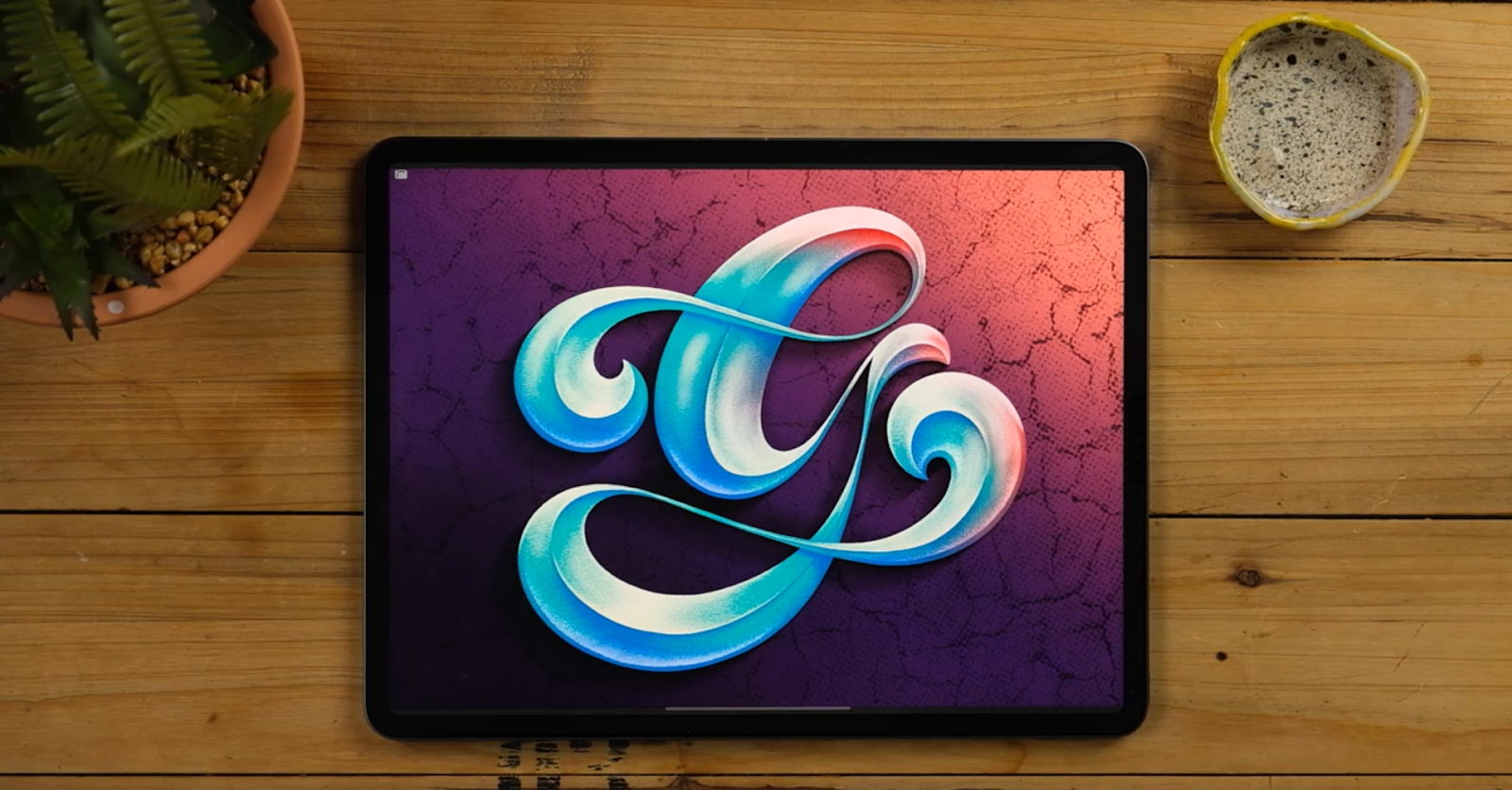
In this iPad lettering tutorial, you will find the detailed process on how to achieve a realistic bevelled letter on Procreate.
Date: 6th of JULY 2021
Est Read Time: 9 mins
Do you want to learn how to make a realistic bevel effect so you can bring your letters to the next level? In this iPad lettering tutorial, you will find the detailed process on how to achieve the best results with free resources. It is made for beginners and creatives who own an iPad and want to step up their lettering game. This Bevelled Lettering Effect technique can be applied in any letter style and you’ll see how easy it is once you see all the steps.
TOOLS TO START THIS TUTORIAL
- iPad Pro (You can use any iPad as long as it supports the Procreate App)
- Procreate Software
- Apple Pencil (or any other compatible stylus)
- Shoutbam Lettering Brush Collection
PS. If you don’t have our latest product Shoutbam Lettering Brush Collection, try out the Free Sample Set in our Freebie Treasury available for our awesome community newsletter subscribers.
Let’s draw Bevelled letters in Procreate with bonus tips and tricks. Let’s dive in!
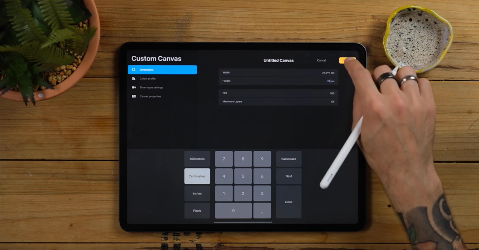
CREATE A NEW DOCUMENT
Before we reveal the steps, you need to create a document.
- For this tutorial, use 22 x 30 centimetres at 300 dpi. This size will occupy most of the screen!
- You can literally use any other format as long as it’s big enough so it doesn’t get pixelated.
STEP 1 - SKETCH YOUR LETTER
- We will start by sketching out a single letter or even a word (if you have time and feel comfortable about it)
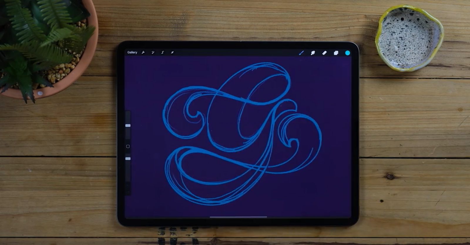
- It can be any style but if you wanna follow along without complications I would recommend to go with a contrasted script letter.
- Remember the more contrasted, the bigger the difference in between thick and thin strokes.
- Grab an Inker and draw on a new layer
- Create a new layer and select an inker together with any color you like. Here I’m using inkers from the full brush collection but remember that you can use any you already have. Once the letter is fully outlined fill it with the same color.

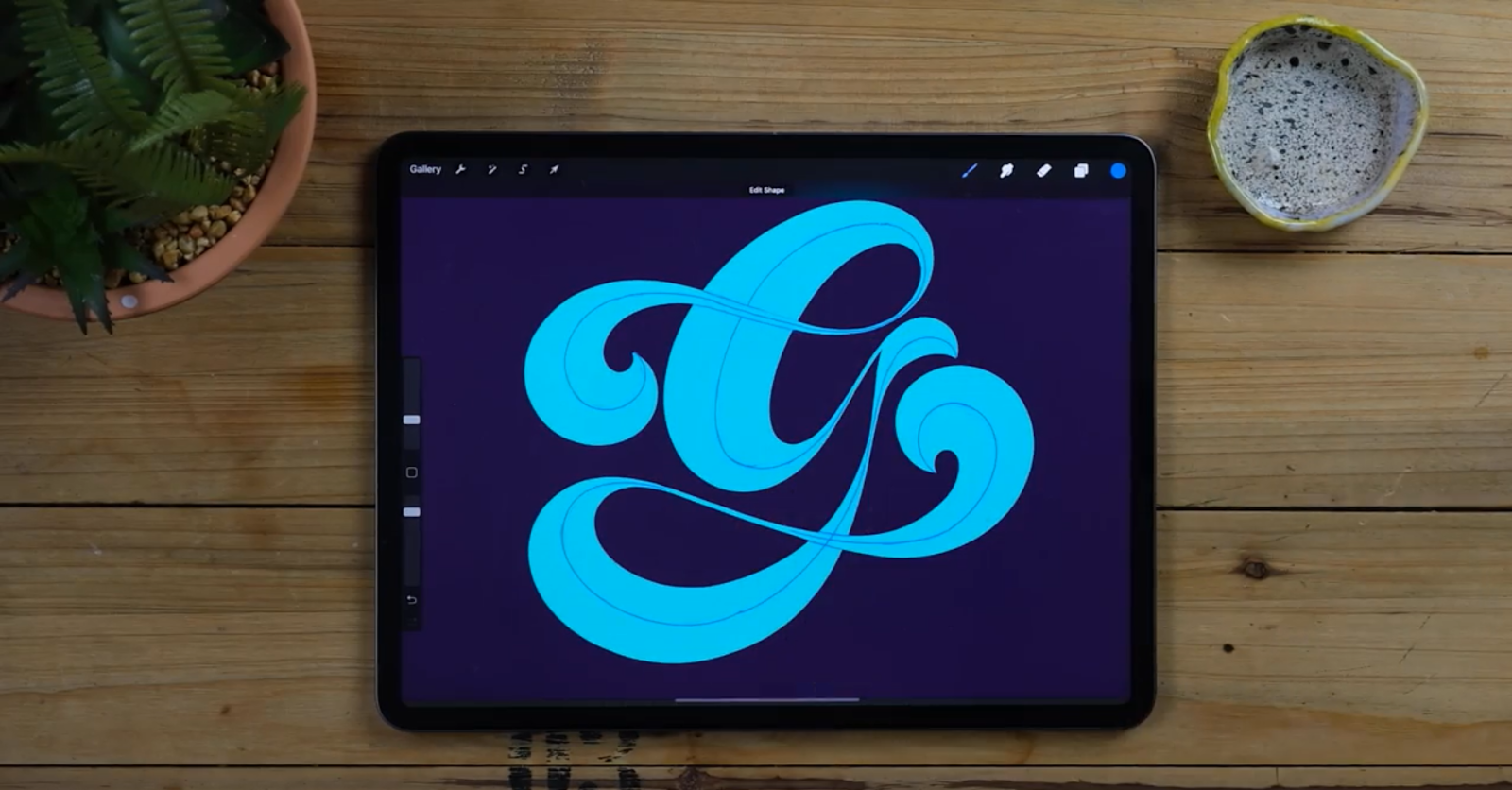
STEP 2 - ADD GUIDELINES FOR THE BEVEL
- Grab a darker color and your favourite pencil from Shoutbam Lettering Brush Collection.
- Go to the layers panel and rename your letter.
- Now sketch little dots or dashed lines that travel through the middle of the letter and then convert them into a line.
- It’s really important to determine the centre of your bevelled letters before starting adding the effect.
- Add some more guides to determine which parts will go in front and underneath.
Pro Tip: Do all the steps to ease the process afterwards
STEP 3 - CREATE ALL THE FACES
This is probably the most important part of the whole process.
- Choose a new color and select Wet Inker from Shoutbam Lettering Brush Collection.
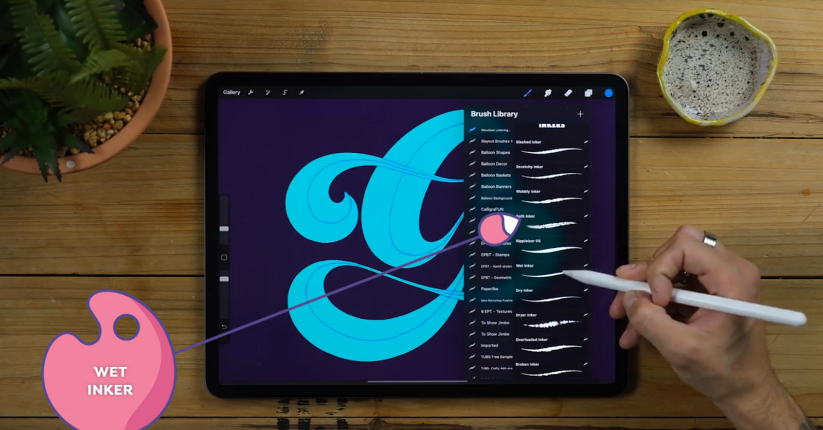
- Bring the guidelines' opacity down and create 2 or 3 new layers underneath.
- Change the name of the layers to “x” “w” “z”.
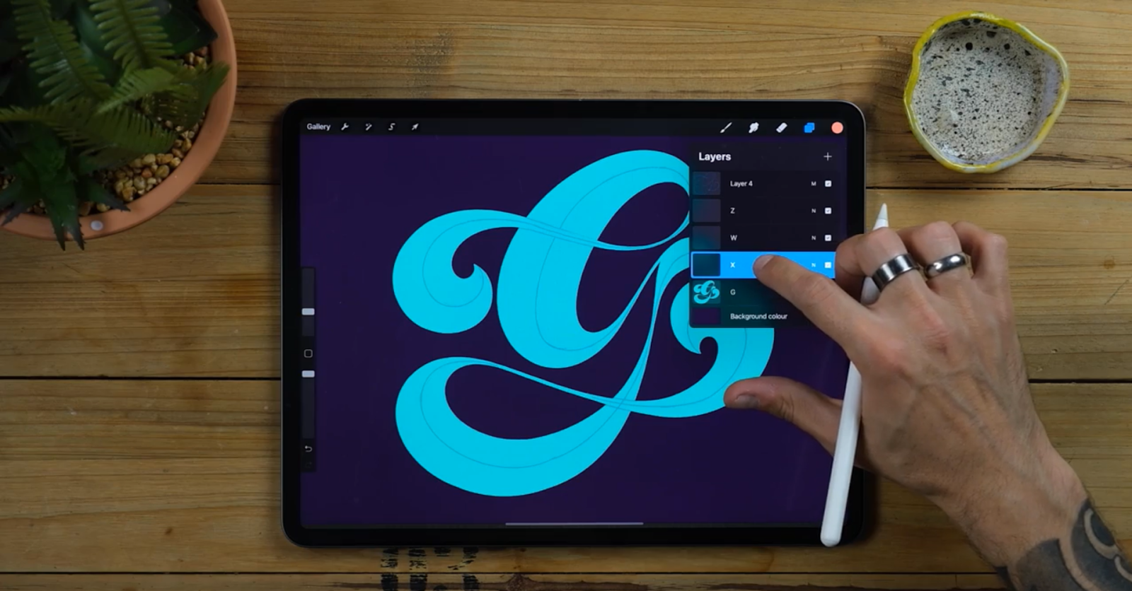
- Tap on each of these layers and select the clipping mask.
- Anything you paint in this layer will not go out from the layer underneath, in this case your inked letter.
- Grab the Inker and start creating the letter shapes.
Since we have the halves sketched out, we just have to make sure we follow the line and that we balance out both parts. Start with a light orange and draw the parts that are not touching each other on the same layer.
- Select a lighter color and paint new parts on a new layer.
- Since the layer is completely divided, you won’t be needing the 3rd layer so just erase it.
- In the part which is shown in the photo below, that little piece will go behind. Grab an eraser (any native calligraphy brush) and erase the part and all the other unnecessary ones.
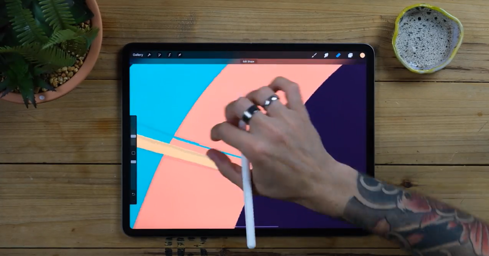
You can also now erase the guidelines since we won’t be needing them anymore
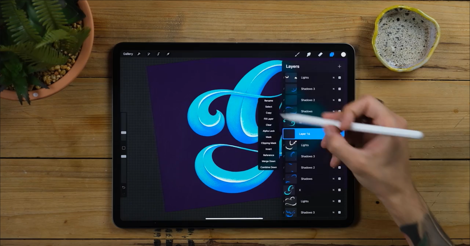
STEP 4 - RELEASE CLIPPING MASKS
- Release the clipping masks by keeping the same shapes.
- Tap on the layer and now tap on the Clipping mask again.
- You’ll see that shapes are getting messier because they show the imperfections hidden by the clipping masks.
- Let’s clean that up! Tap on the original G and tap select.
- Now go to the bottom panel that just popped up and Tap on the invert.
- Now select back one of the layers that was previously a clipping mask.
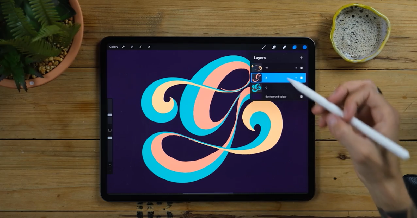
- Scroll three fingers down and tap on the cut. Boom! Now repeat the same in the other layer.

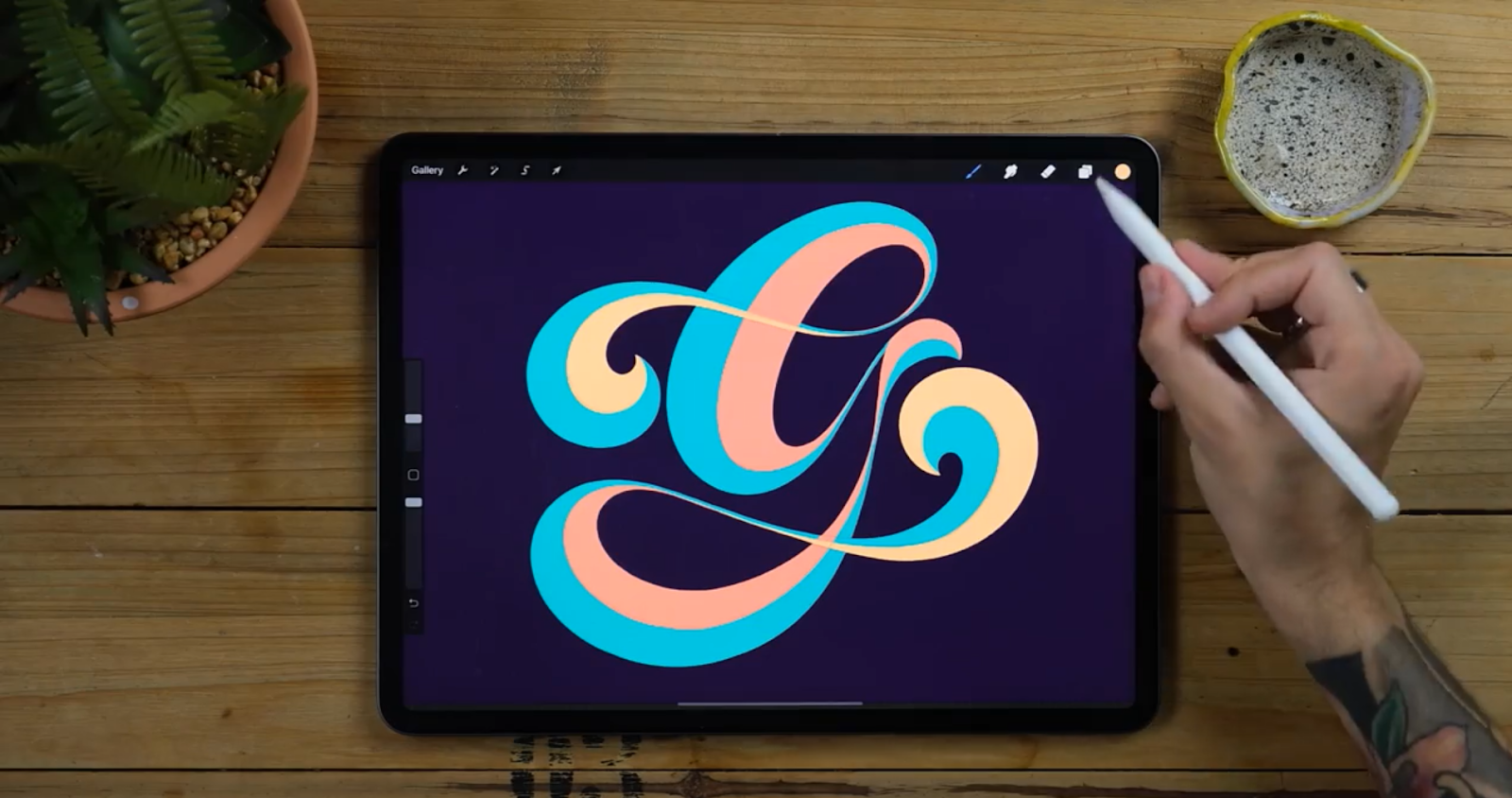
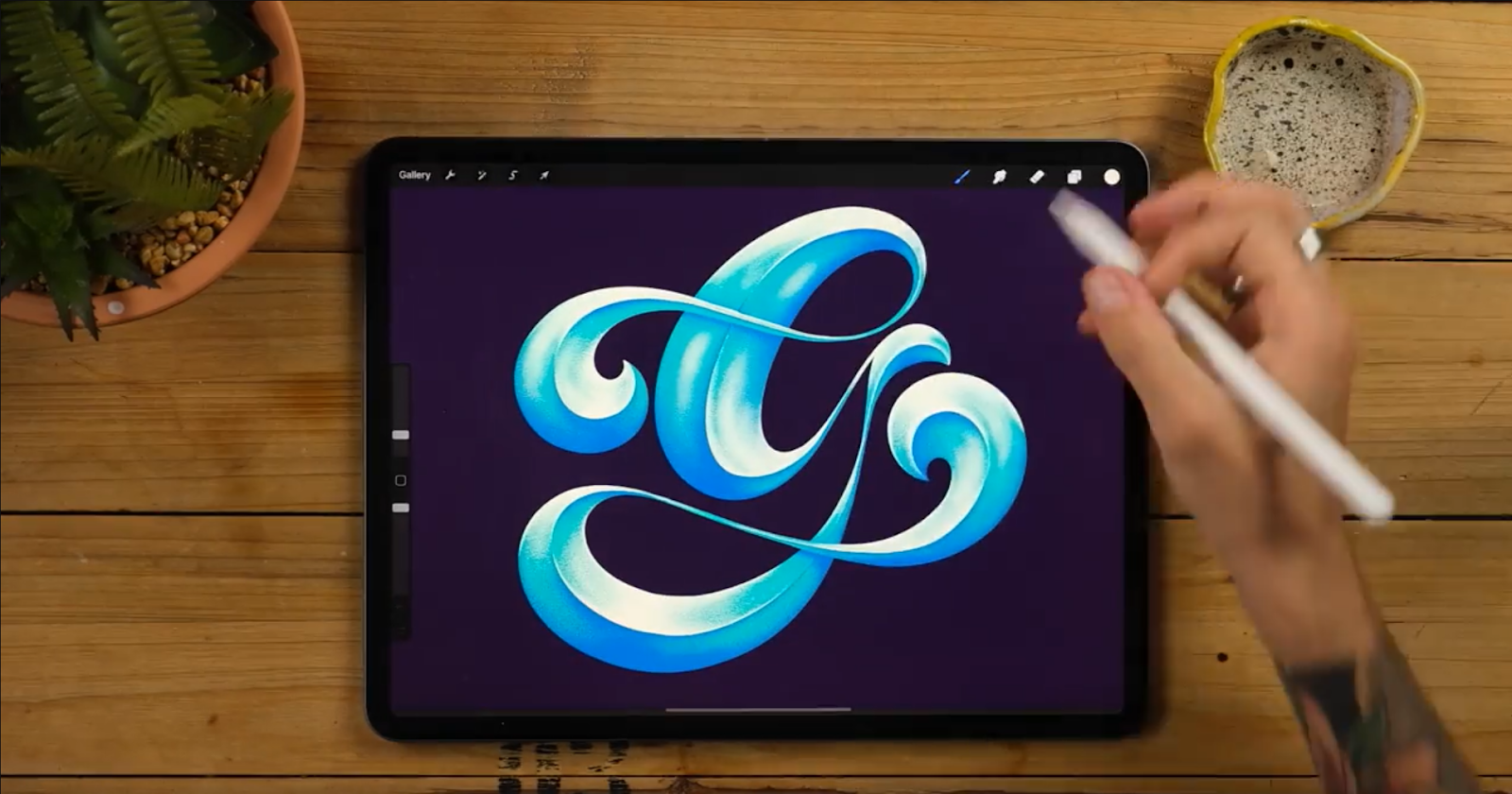
STEP 5 - MATCH THE COLOURS
Before starting the texture work we will Match the colours so it all looks the same.
- Decide on 1 color and drag it in all the layers.
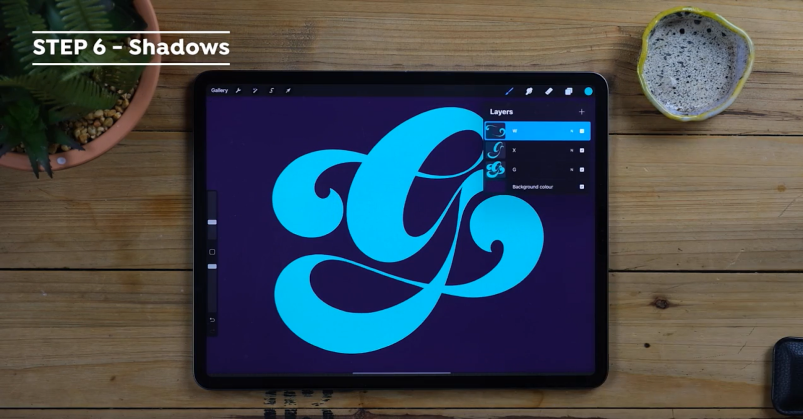
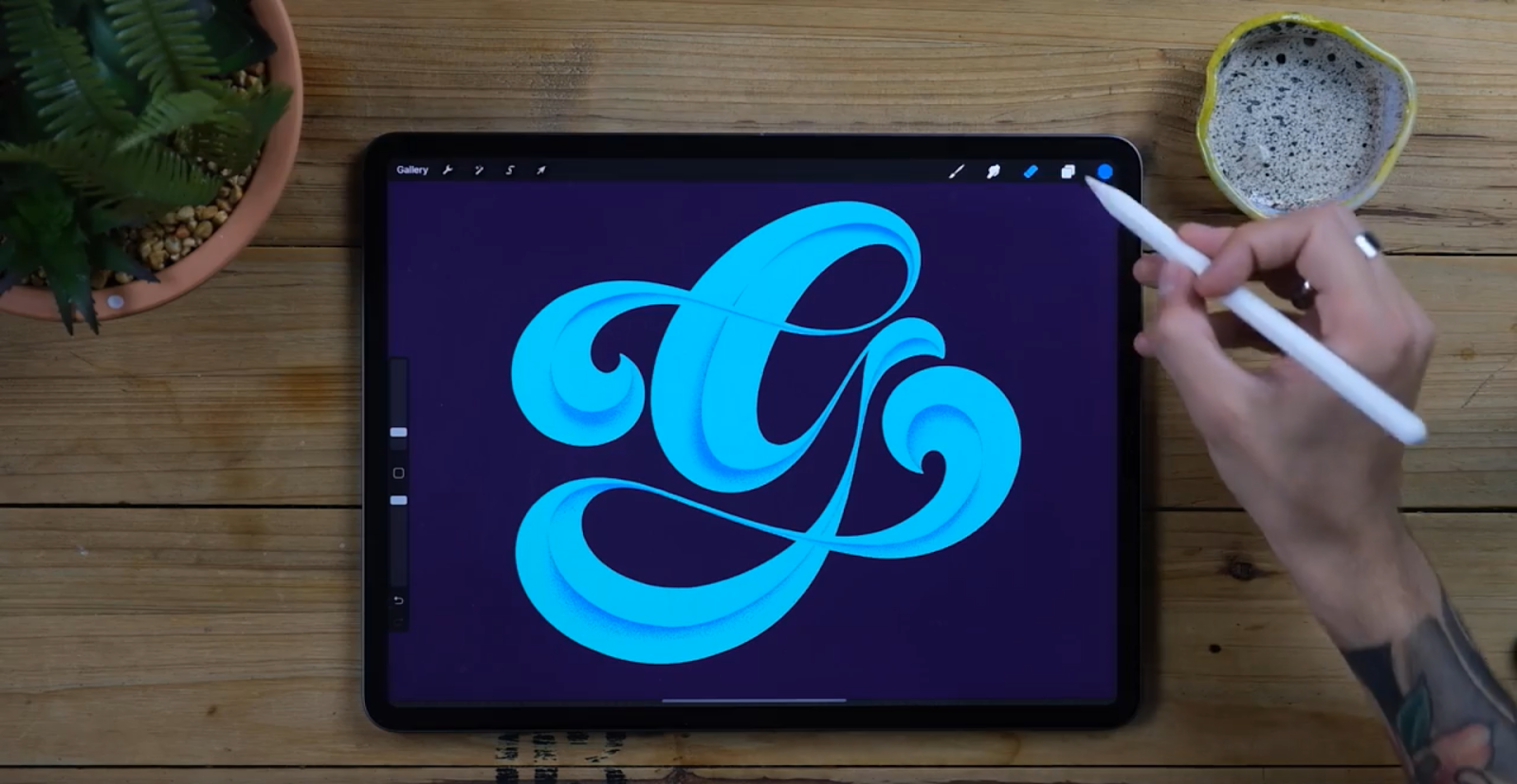
STEP 6- ADD THE SHADOWS
- The first thing we want to do is create clipping masks on top of each layer that we now have. Rename those layers into “shadows”
- Once we’ve done that we are going to select a darker color (in my case a darker blue) and we will select a brush that gives us a nice texture.
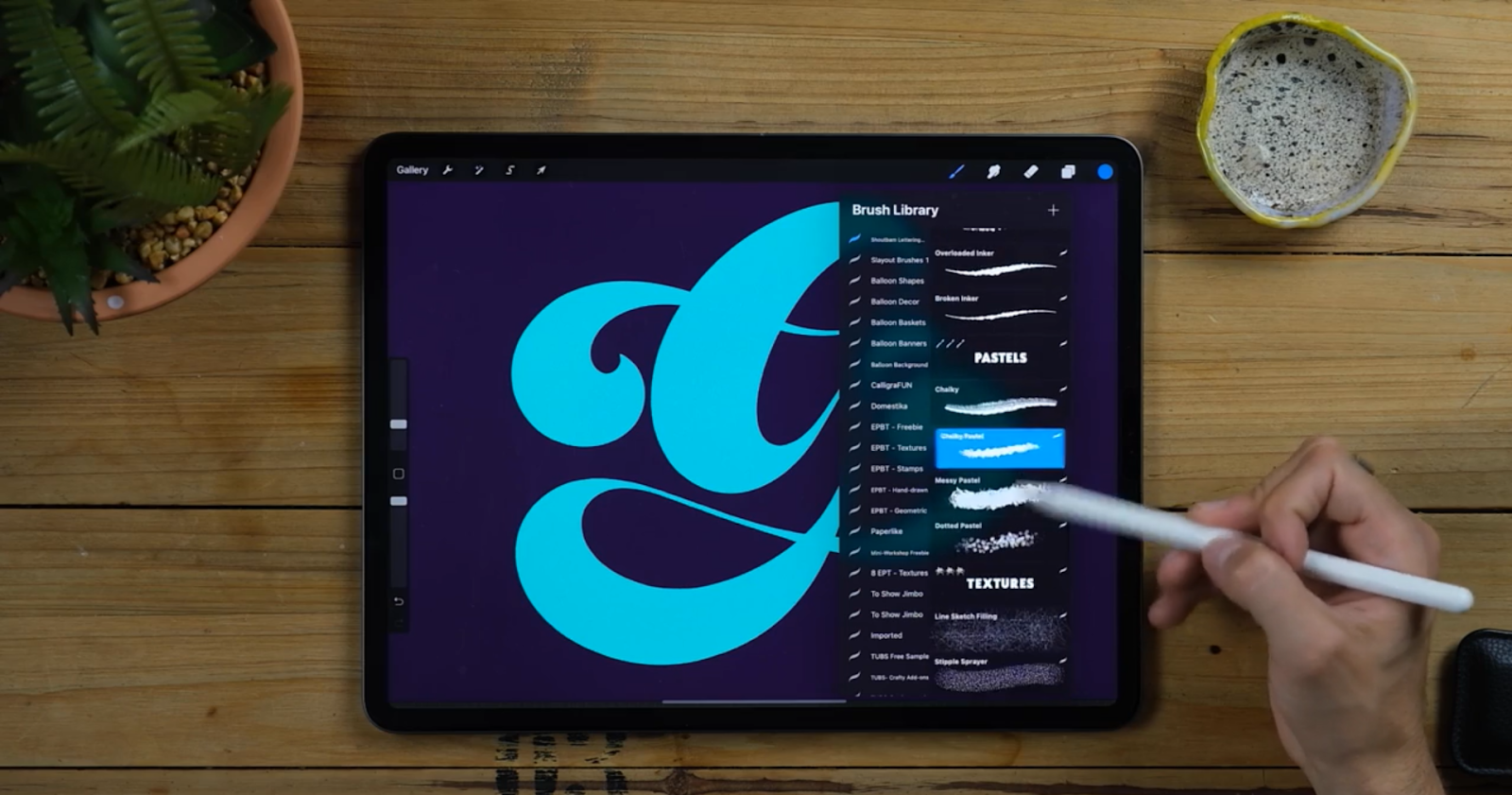
- At this point you would like to check the freebie we’ve prepared or any other brush you can get for free when becoming a newsletter subscriber.
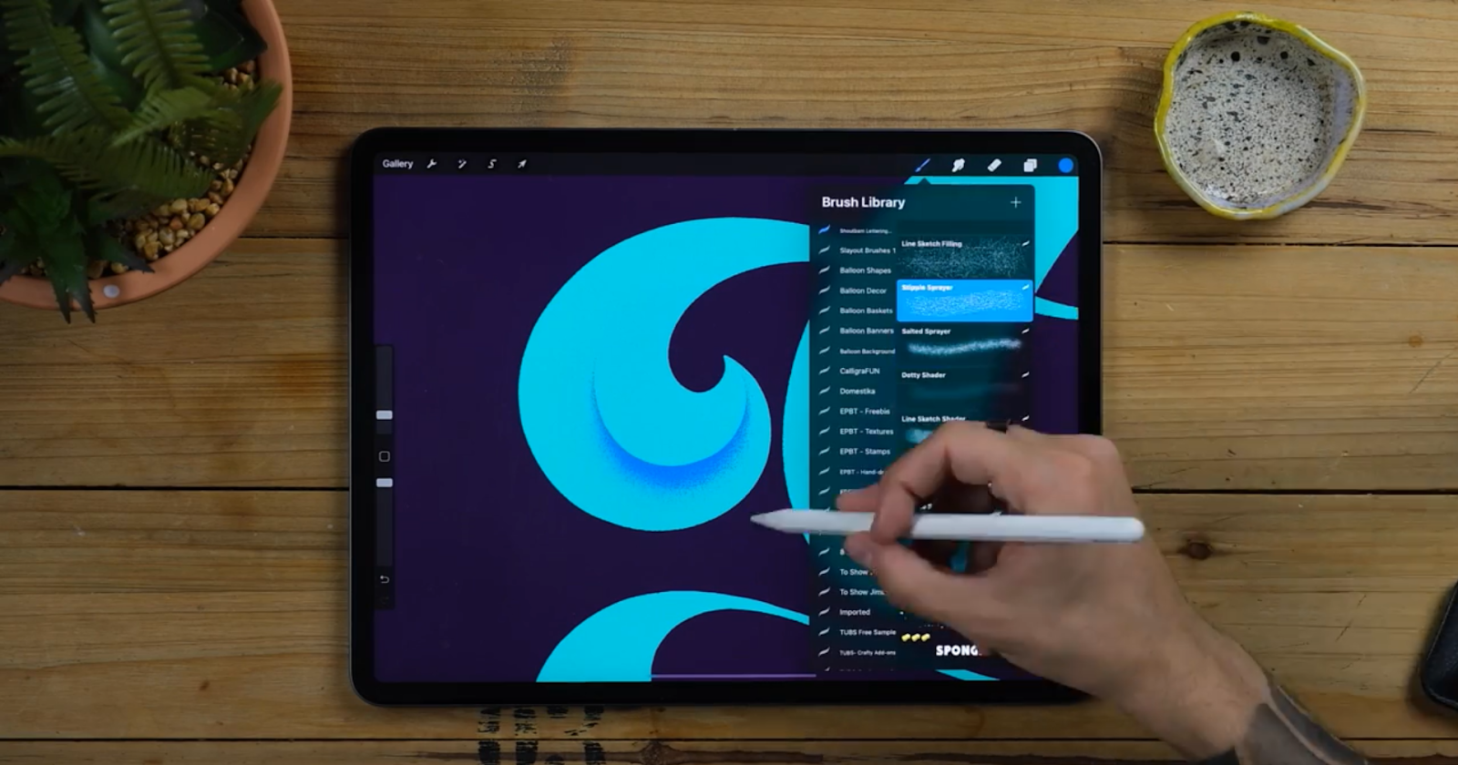
- Select the Stipple Sprayer from the Shoutbam Lettering Brush Collection. Any of these textures will work just fine but the Stipple Brush will give us larger dots that will be great to start the shadows.
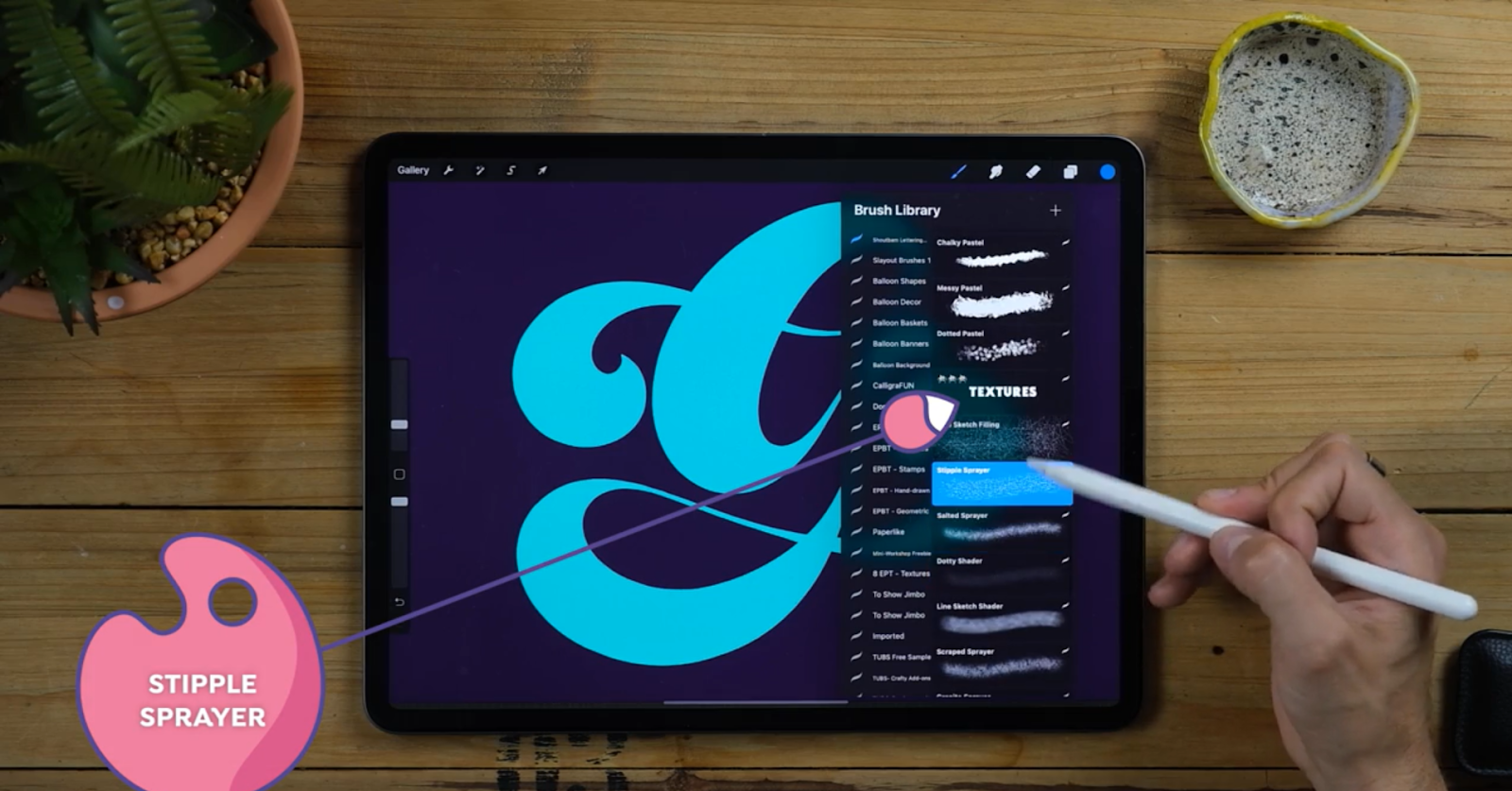
- Go to the clipping masks we’ve created and start spraying the bottom halves in the exact parts where our sketch line was in the beginning.
- Follow this exact moon shape I’m doing by firstly creating a single texture line and then filling up with dots the centre of the shape.
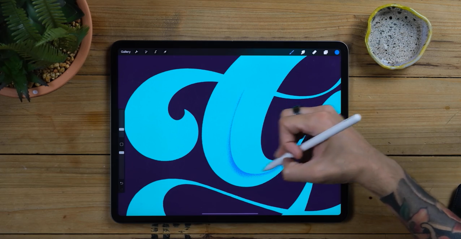
- Now switch from one layer to the other and in the point where it gets thinner we are gonna sort of connect it with other shadows like this.
- The shadows will touch with one another as they decrease in opacity and size.
Remember that this meeting point is key to better get the effect we’re looking for! The brush Salted Sprayer from Shoutbam Lettering Brush Collection is a nice complementary brush since it will give you smaller speckles that will help with the gradients.
- Now create more clipping masks and we will use them to create straight shadows that will determine what parts of the letter will go on top and underneath.
- While spraying shadows you will also have to erase parts you don’t want, select any calligraphy brush as eraser for doing that.
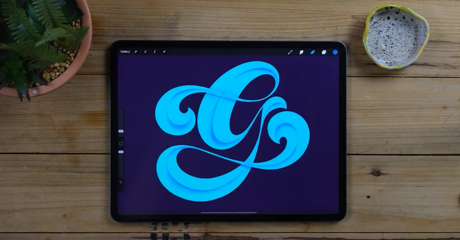
STEP 7 - CREATE SECONDARY SHADOWS
- Now that we have the middle shadows painted it’s time to paint the bottom shadows.
- Create new clipping masks so they don’t mix up with the previous ones.
- In the points where your shadows were stronger before trying to blend in with new shadows.
- Do you remember the moon shapes I was talking about? Well now we will reverse that.
- Try to touch the bigger parts of the previous shadows and make them thinner as they separate.
- If you don’t want to be erasing parts you didn’t intend to paint, head to the selection tool and select Freehand from the bottom menu.
- Now circle those parts you’re shadowing!
Pro Tip: Throughout the process you can grab your phone and do tiny clips of your steps so you can later make reels and have some extra content on Instagram. You can tag us at shoutbam or jimbobernaus so we can check out your work and share it in our stories!
STEP 8 - ADD LIGHTS
- Create new clipping masks and change their name to “lights”. Now we will Repeat the same steps but upside down, you’ll see! Select a light color, white or almost white will do.
- You remember the meeting points of our shadows? Well now it’s time to basically do the exact same thing but with the lights. You’ll notice how easy it got now since you already mastered the technique doing the shadows.
- Now in the same way we did our shadows, we will create more clipping masks for secondary lights.
- These ones will come from the top parts and will again join like the shadows did before.
- Allow yourself to be more free in here and spray also a little bit more randomly here and there.
Remember that by the end of the day, we are here to have some fun.
STEP 9 - ENHANCE BY ADDING FINAL EXTRA LIGHTS
- Create a layer on top of everything and spray some lights on the shadows. Here you can experiment a bit with colours and modes.
- Try to use lightning modes such as Overlay and contrasted color (in my case a bit orangy)
- Spray these lights following a moon shape as before and Now grab an eraser from the native calligraphy panel, any!
- Now do a clean cut following the shape of the letter and you’re ready for the last step.
Before moving on, change the background’s colour into a slightly lighter purple.
STEP 10 - CAST SHADOW AND FINAL EFFECTS
- Duplicate the g and drop a dark color in it.
- Now duplicate this layer and with the transform tool move it following the light source.
- Since my lights are coming from up, this shadow will go down.
- Now join the corners of this shadow with the corners of the original letter.
- Go up to Adjustments and select motion blur.
- Now with the pencil on the screen move the shadows towards their direction and you’ll see a nice shadow that disappears the further it gets from the letter.
- Now grab a native procreate soft airbrush and erase the parts of the shadows that are left on top of the letter.
- Move it around and bring the opacity down until you’re satisfied. On the second shadow we have you can try to add a little bit of gaussian blur and finally play with both.
- Create a new layer at the bottom of it all and using a native soft airbrush, spray some black color on the bottom left corner and some lighter color on the top right corner.
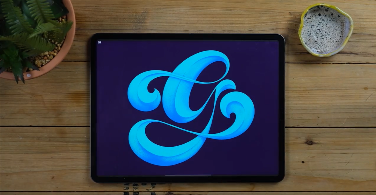
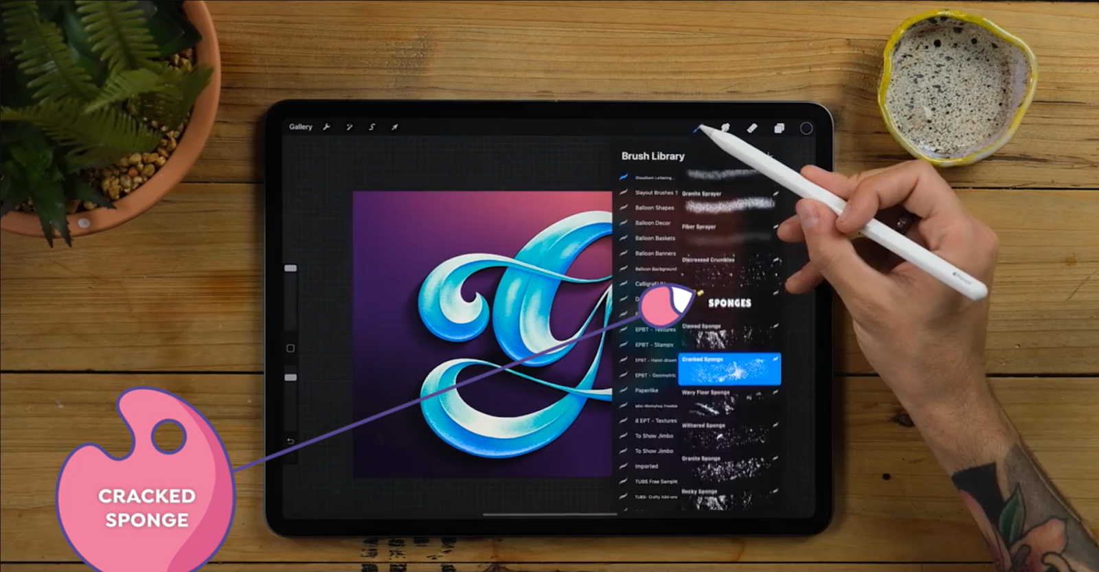
- Now create a new layered set it to Multiply. Add some nice texture from the Shoutbam Lettering Brush Collection but you can use any brush you have! This one is called “Cracked Sponge” and it will give a seamless cracked floor texture that will add realism to the piece!
Voila! it’s done. Just like that you’ve just created a nice bevelled letter with some wonderful textures!
THE END!
We really hope you enjoyed this and that you made some beautiful illustrations. You can always leave a comment or reach out to us on Instagram @jimbobernaus if you want to leave feedback or tell us if you would like to learn something particular. We would love to help you out!
We wish you a spectacular day with a taste of creativity. And now - letter away!
Join our Newsletter Community, to get access to all of our freebies, including free Procreate Brushes, Textures, Fonts, and other fresh stuff!