
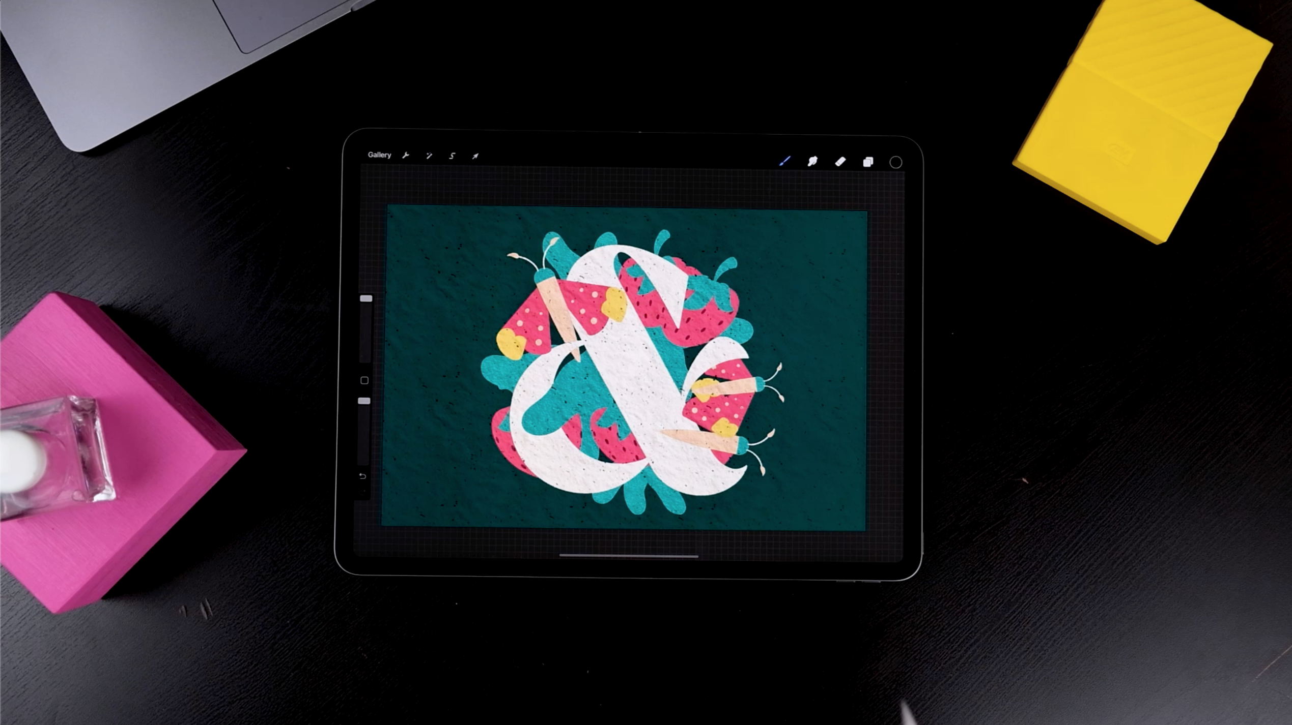
Curious about creating an awesome paper cut effect in Procreate? We have got you covered! Today, learn to create a Lettering Cut Paper Effect in Procreate in 9 simple steps. Also, find bonus tips and tricks to ease out the process for you. Let’s get started! Learn the exact steps to draw an ampersand and other cool elements; you can apply this effect in any of your pieces.
Date: 8th of March 2020
Est Read Time: 8 min.
Curious about creating an awesome paper cut effect in Procreate? We have got you covered! Today’s tutorial will teach you the exact steps to draw an ampersand and other cool elements; you can apply this effect in any of your pieces.
If you don’t know how to draw an ampersand, you can either use a font or get one of the 4 free ampersands we’ve also included in our Free Treasury which comes with a lot of other exciting freebies.
Today, learn to create a Lettering Cut Paper Effect in Procreate in 9 simple steps. Also, find bonus tips and tricks to ease out the process for you. Let’s get started!
TOOLS TO START THIS TUTORIAL
- iPad Pro (You can use any iPad as long as it supports the Procreate App)
- Procreate Software
- The Ultimate Procreate Background Set
PS. If you don’t have our latest product “The Ultimate Procreate Background Set”, try out the Free Sample Set in our Free Treasury available for our awesome community newsletter subscribers.
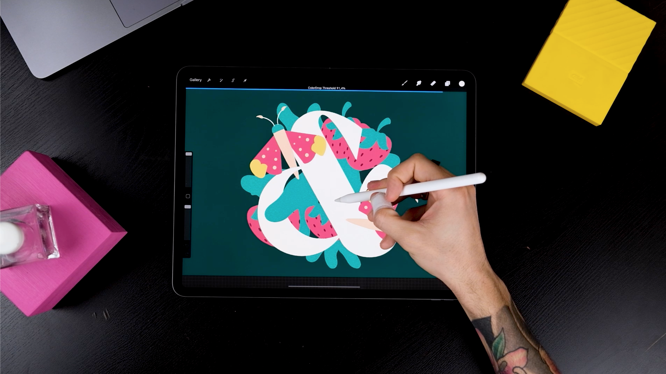
STEP 1: DRAW A LETTER
Start by drawing the ampersand and add a color of your choice from the colors panel. You can use any Procreate Brush that allows you to draw a clean shape. We’d recommend anything from “Calligraphy” native brushes.
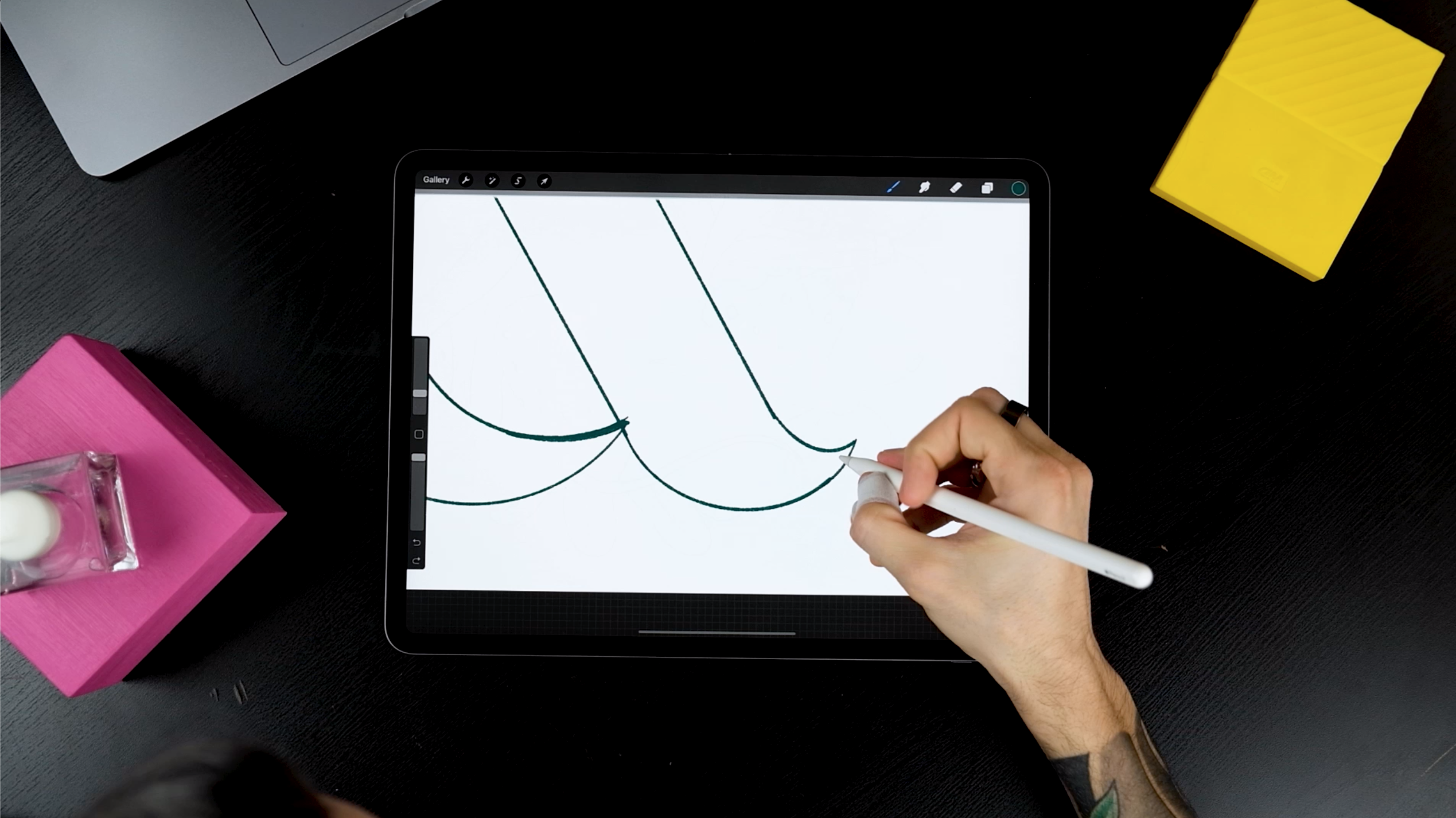
Feel free to draw whatever character you like the most. Absolute freedom at this point!
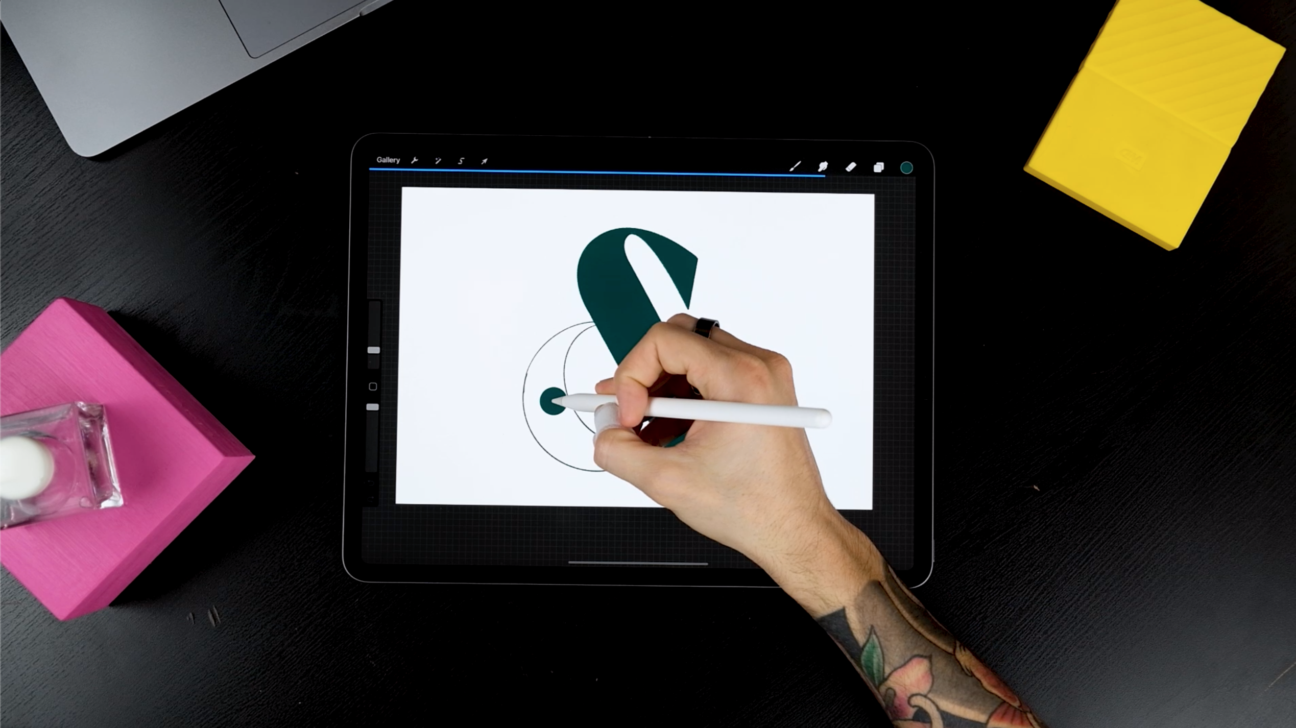
STEP 2: DRAW THE ELEMENTS
To create the elements,
- Choose a new color.
- Add a new layer while you disable (or bring the opacity down) the letter layer from the previous step.
- For this example, begin by choosing a shade of pink.
Next, draw a butterfly.
- For the wings, start with one layer and for the body, create another layer.
- Separating every element on different layers will come in handy later on.
- Imagine cutting actual color papers and piling one on top of the other.
Here’s a little tip: If you are using a smaller iPad, draw less of the elements, or else you’ll probably run out of layers. So, either keep it simpler or create a smaller document with a bunch of layers.
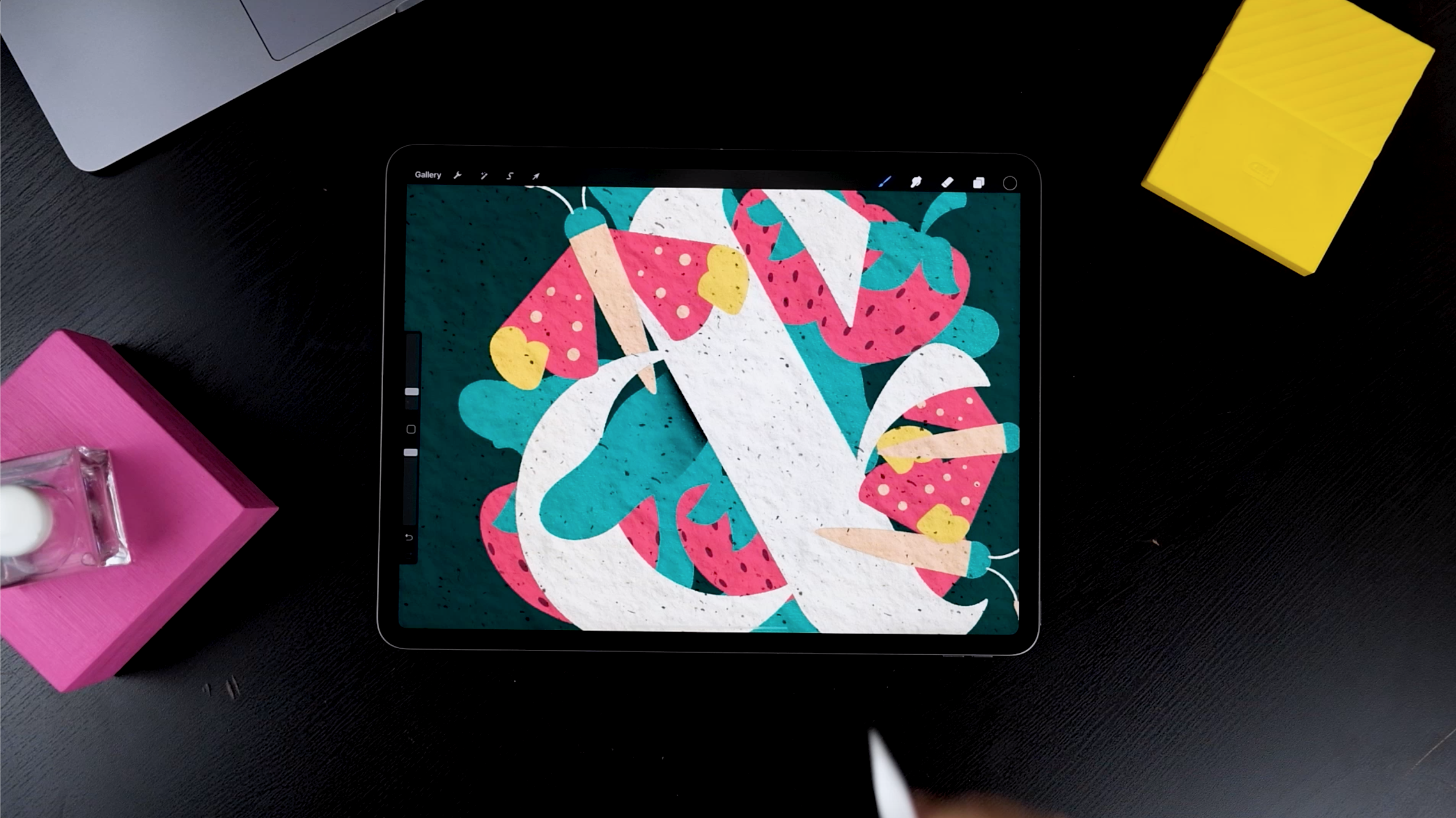
At this stage, you can decide which element goes on top and the bottom. For example, we are cutting these leaves short because we know they won’t show certain parts.
Small details make all the difference. Elements such as strawberry seeds and polka dots on the butterfly’s wings, all go on a different layer.
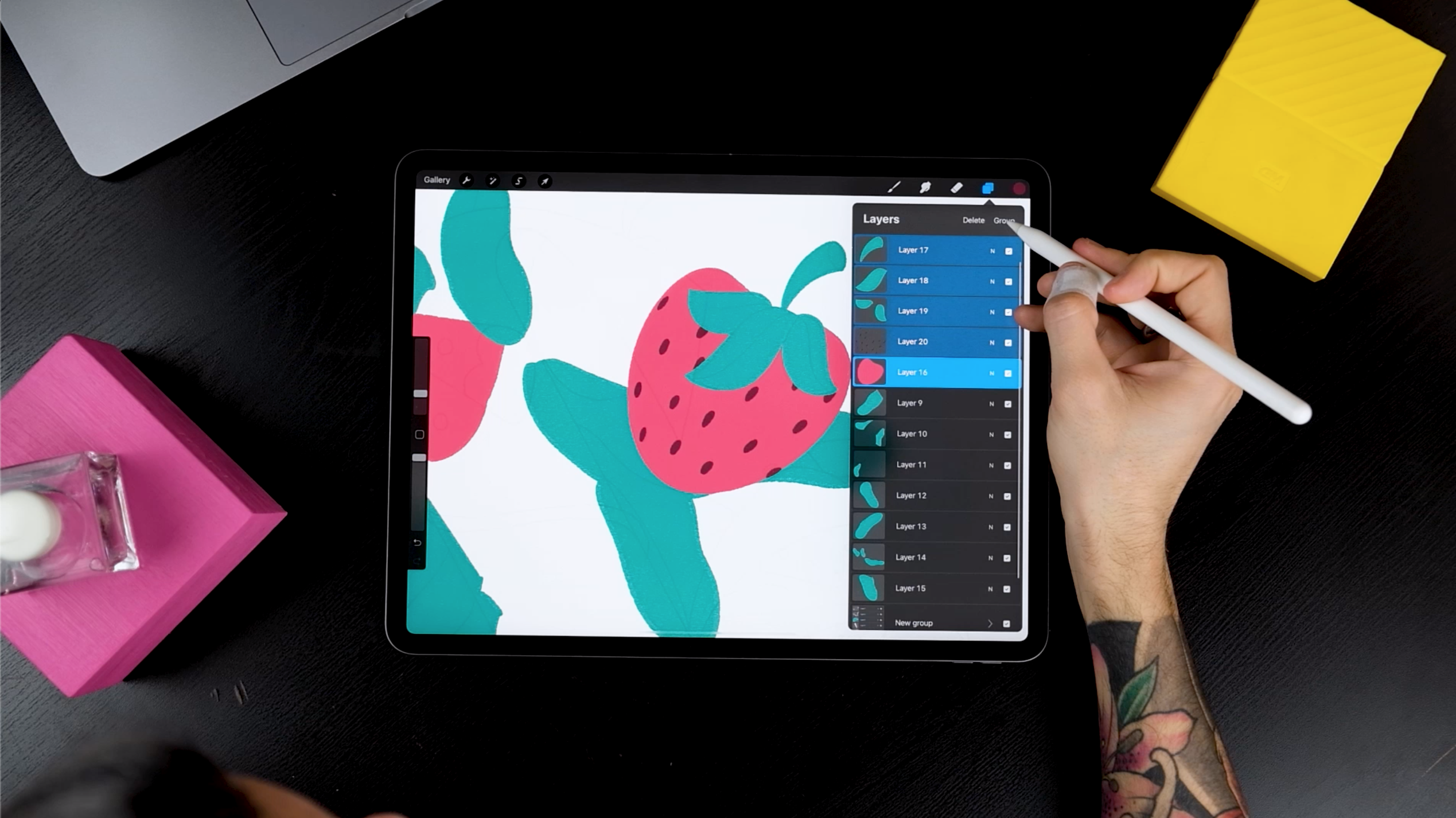
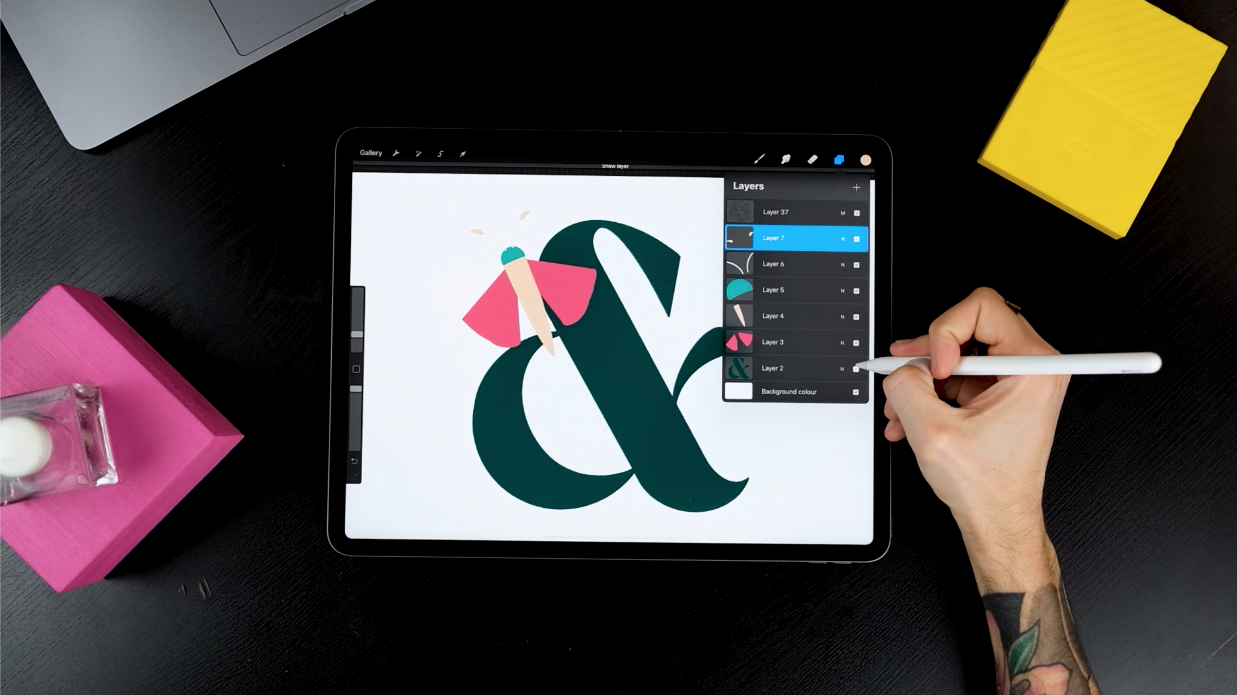
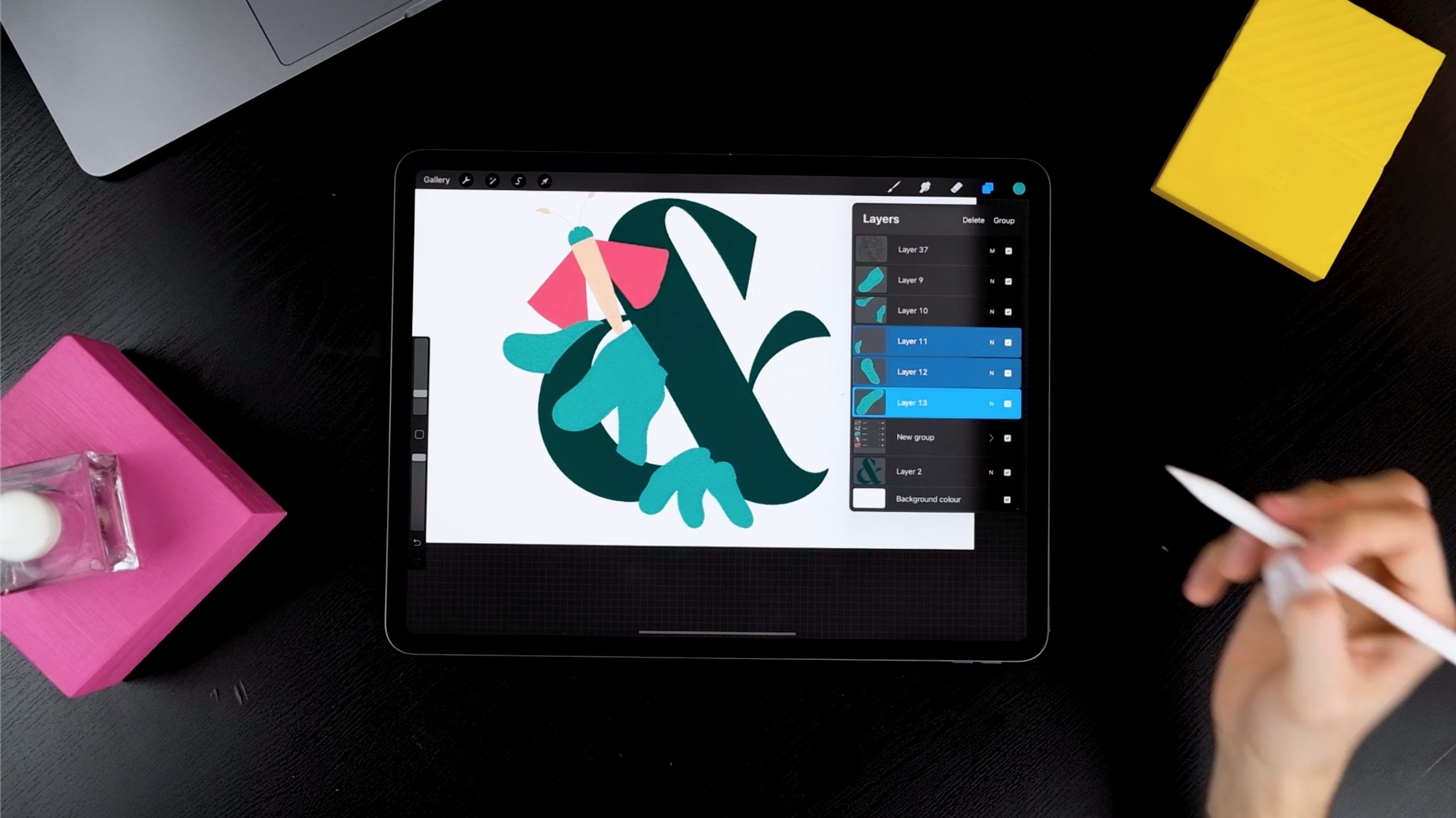
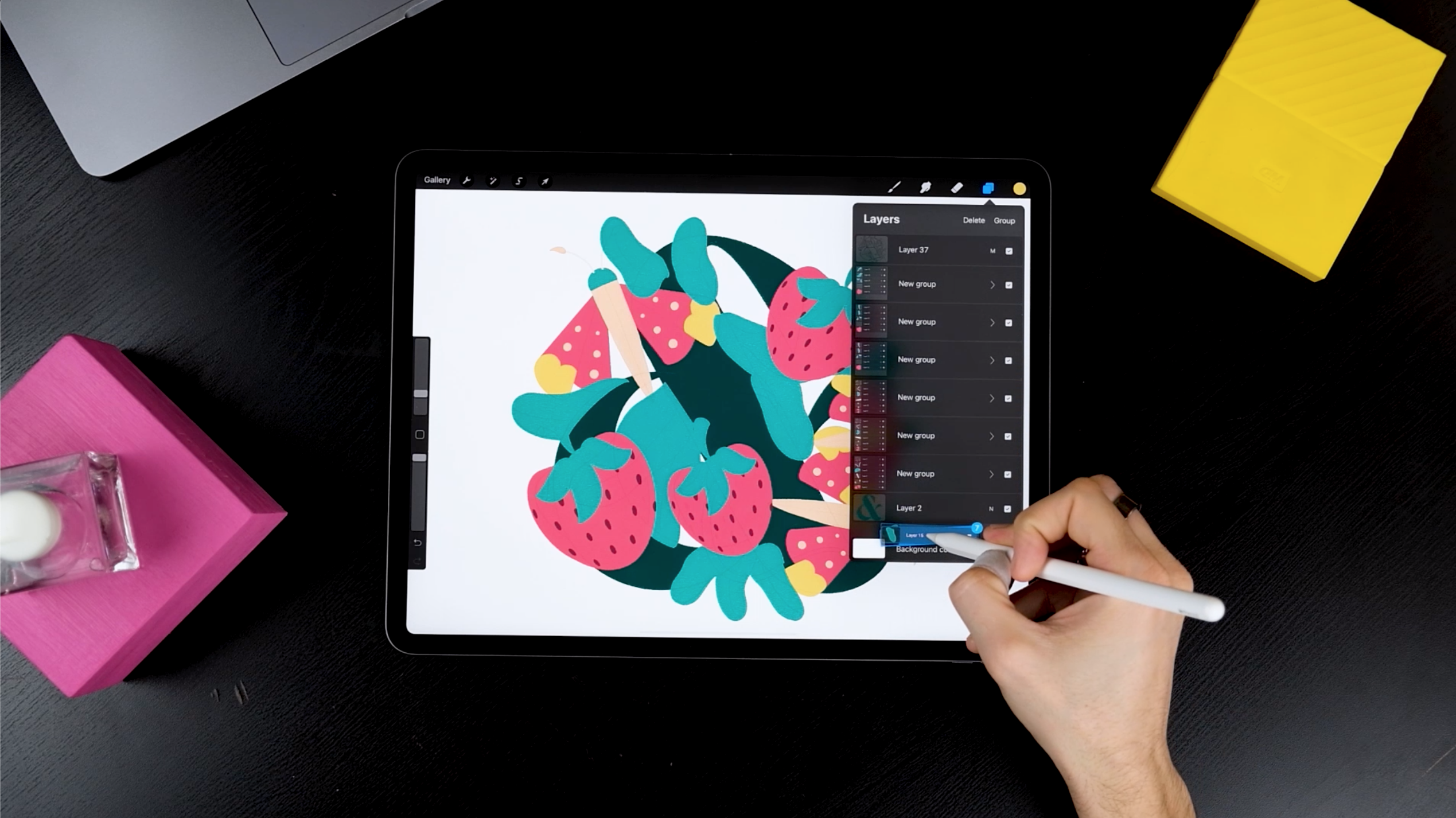
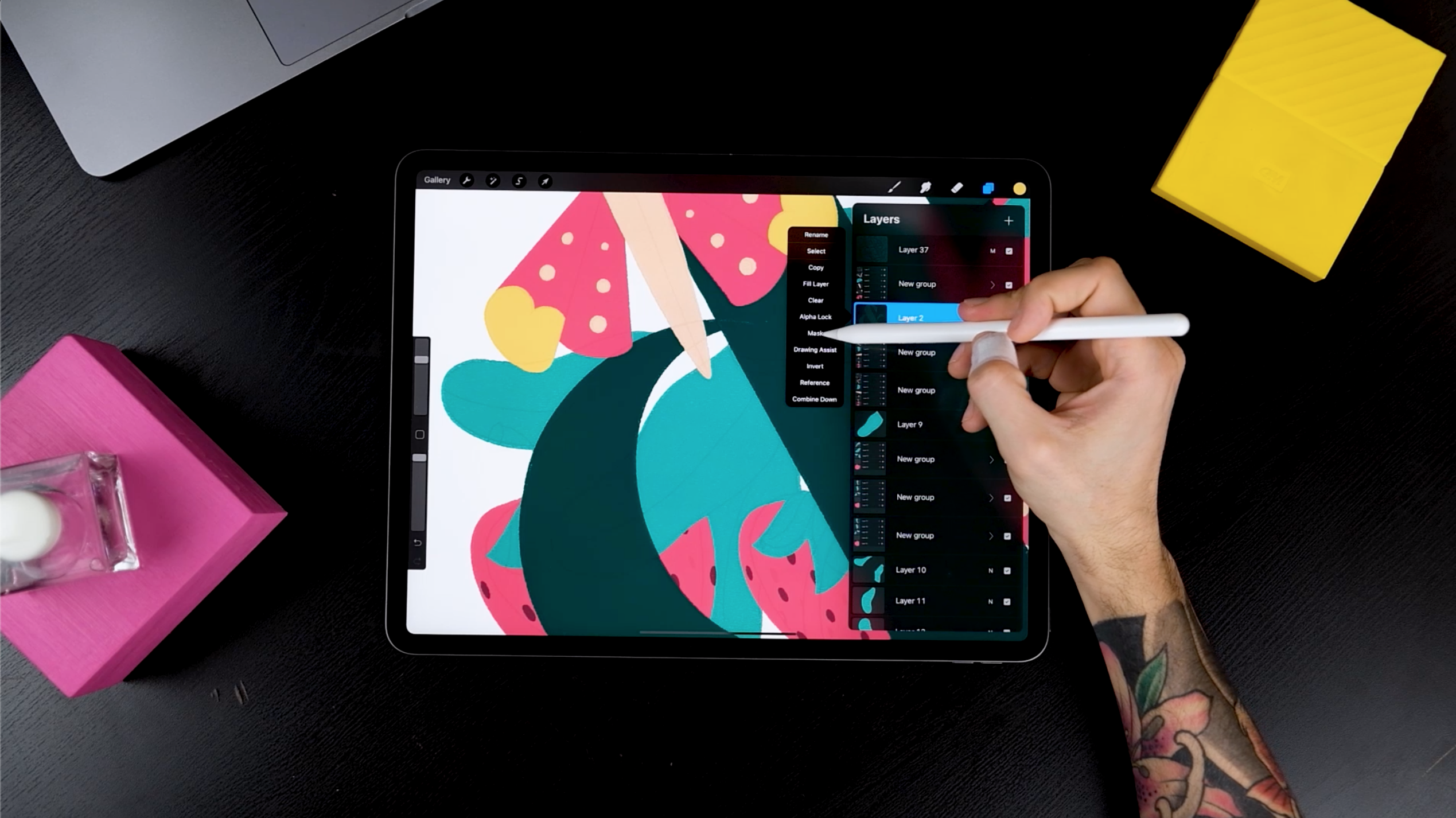
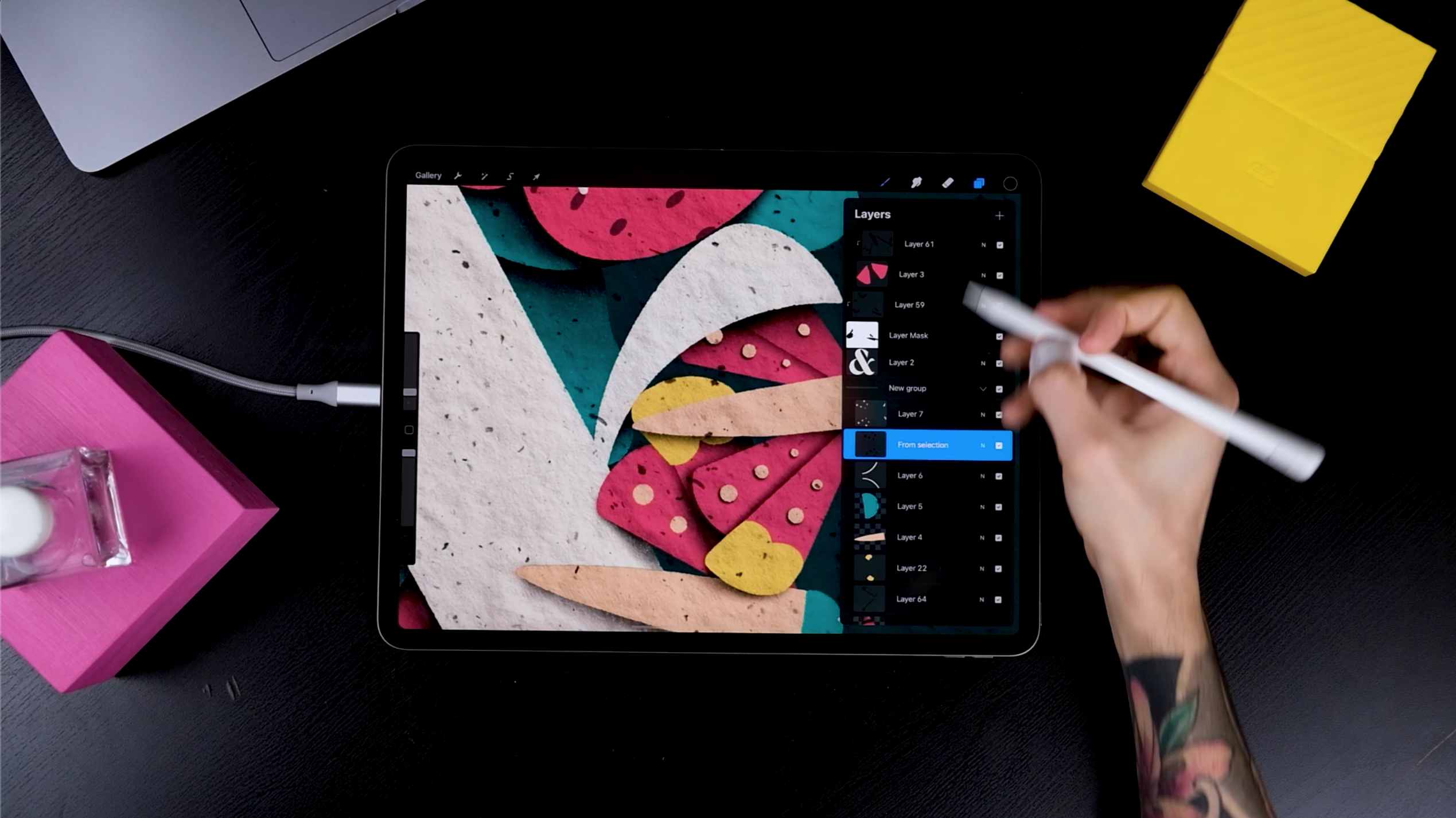
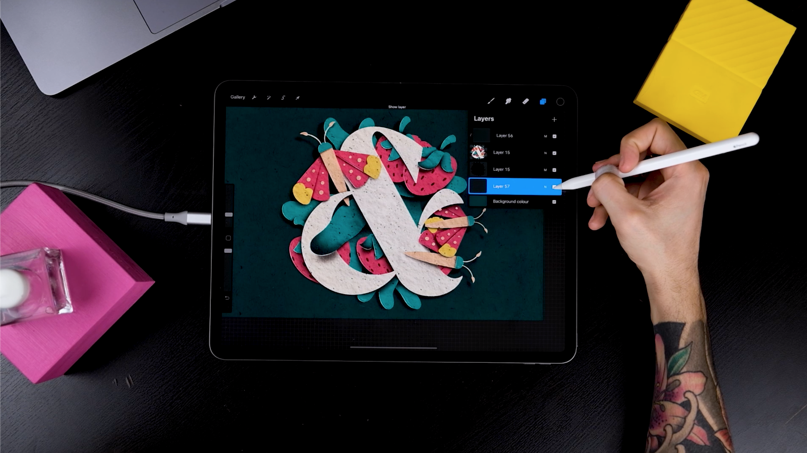
STEP 3: REORGANISE YOUR LAYERS
After creating your elements,
- Duplicate them and place them across the canvas.
- Group the butterfly elements by swiping right on each layer and tapping on “Group”.

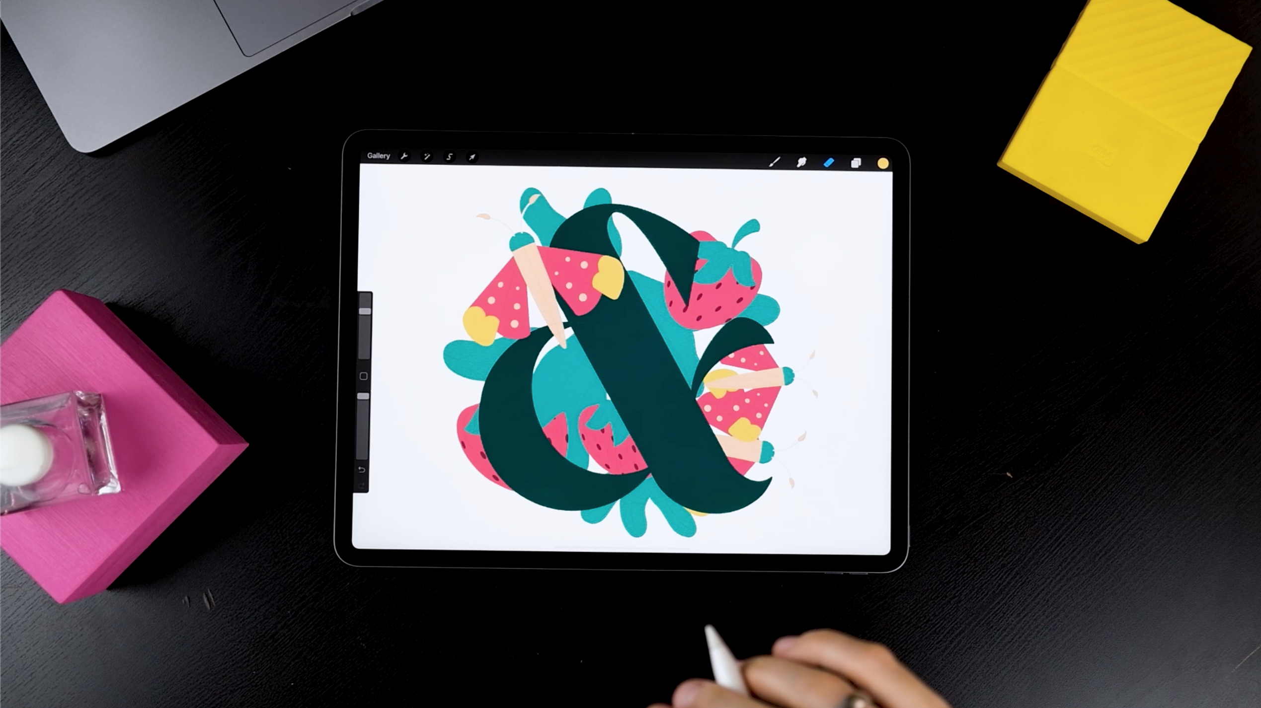
This completes this composition. For this tutorial, move leaves to the background followed by the other elements. Decide the order of all the elements at this stage, although you can change the order at a later stage too.
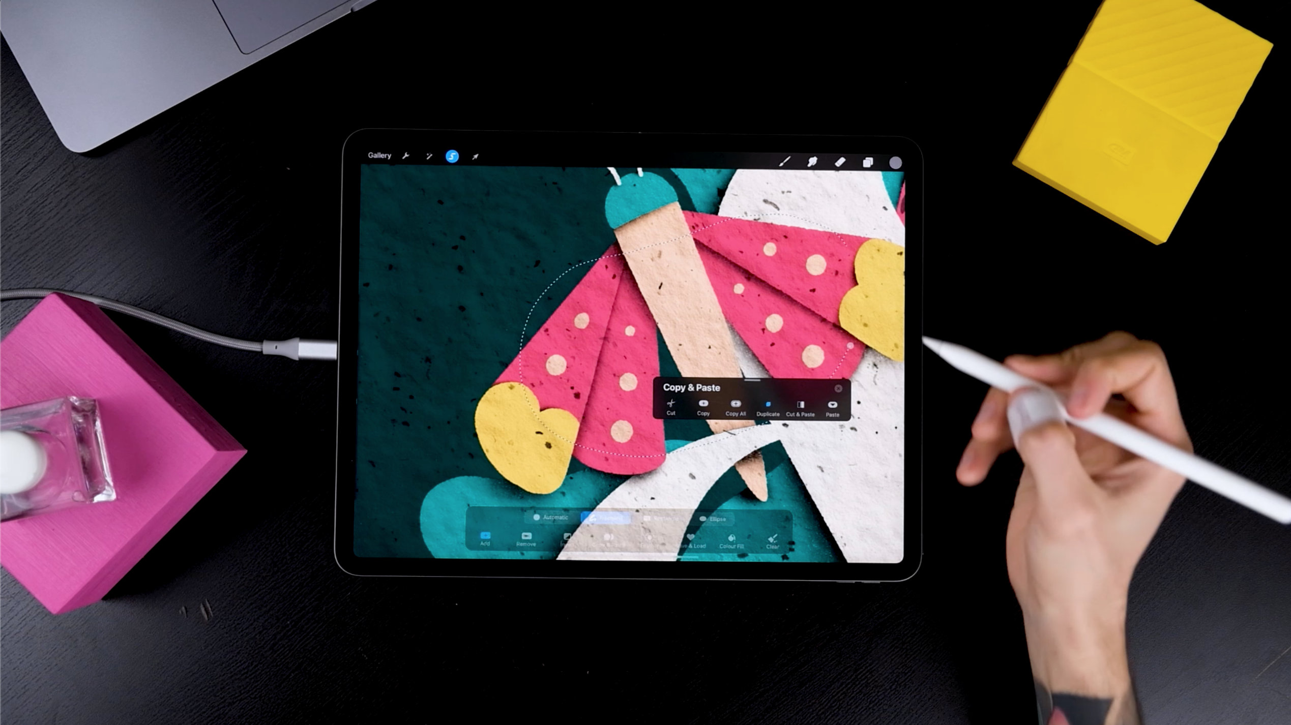
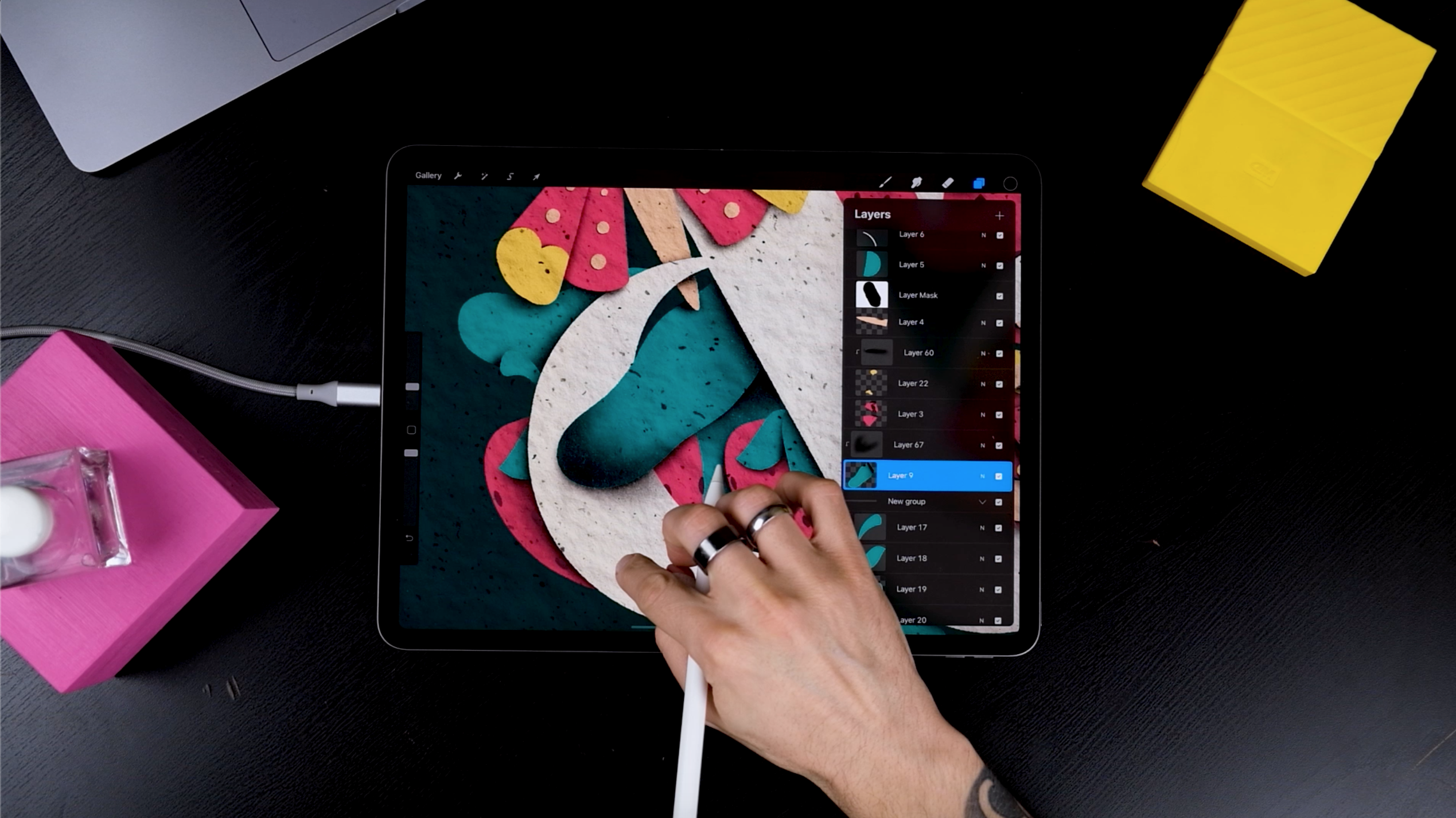
STEP 4: MASK THE ELEMENTS
When some elements are partially behind the ampersand and in the front, it adds depth to the illustration.
- Head to the Layers panel
- Tap on the ampersand
- Select mask.
This hides some parts element without erasing anything.
- Select the element you want to partially show in front
- Tap on it on the layers panel and tap on Select.
- Head back to the Ampersand’s mask
- Pick a 100% black color, select a solid brush (the one you used to draw all the elements or another brush of your choice), and paint on top.
You’ll notice that the leaf starts showing but we’re actually not erasing the ampersand, just hiding it! Mask is an incredible tool, isn’t it?
Repeat the steps from above across the entire artwork.

Here’s a little tip: If you’re running out of layers, try joining the ones that are not touching each other.
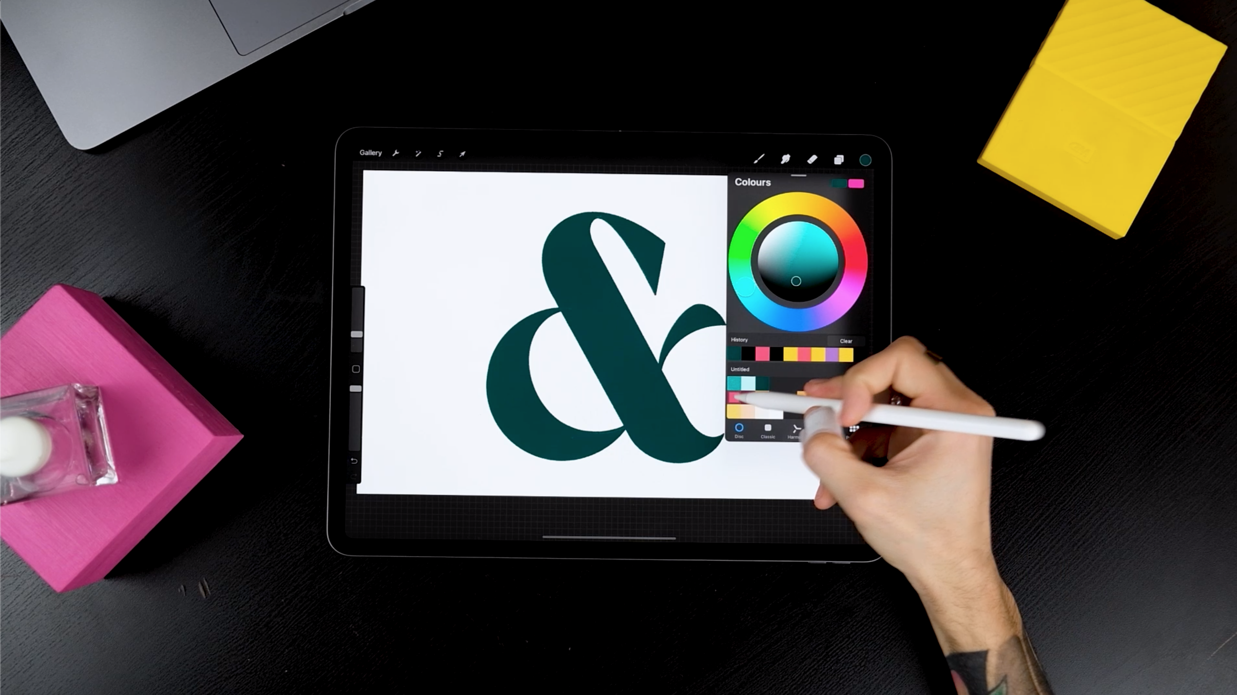
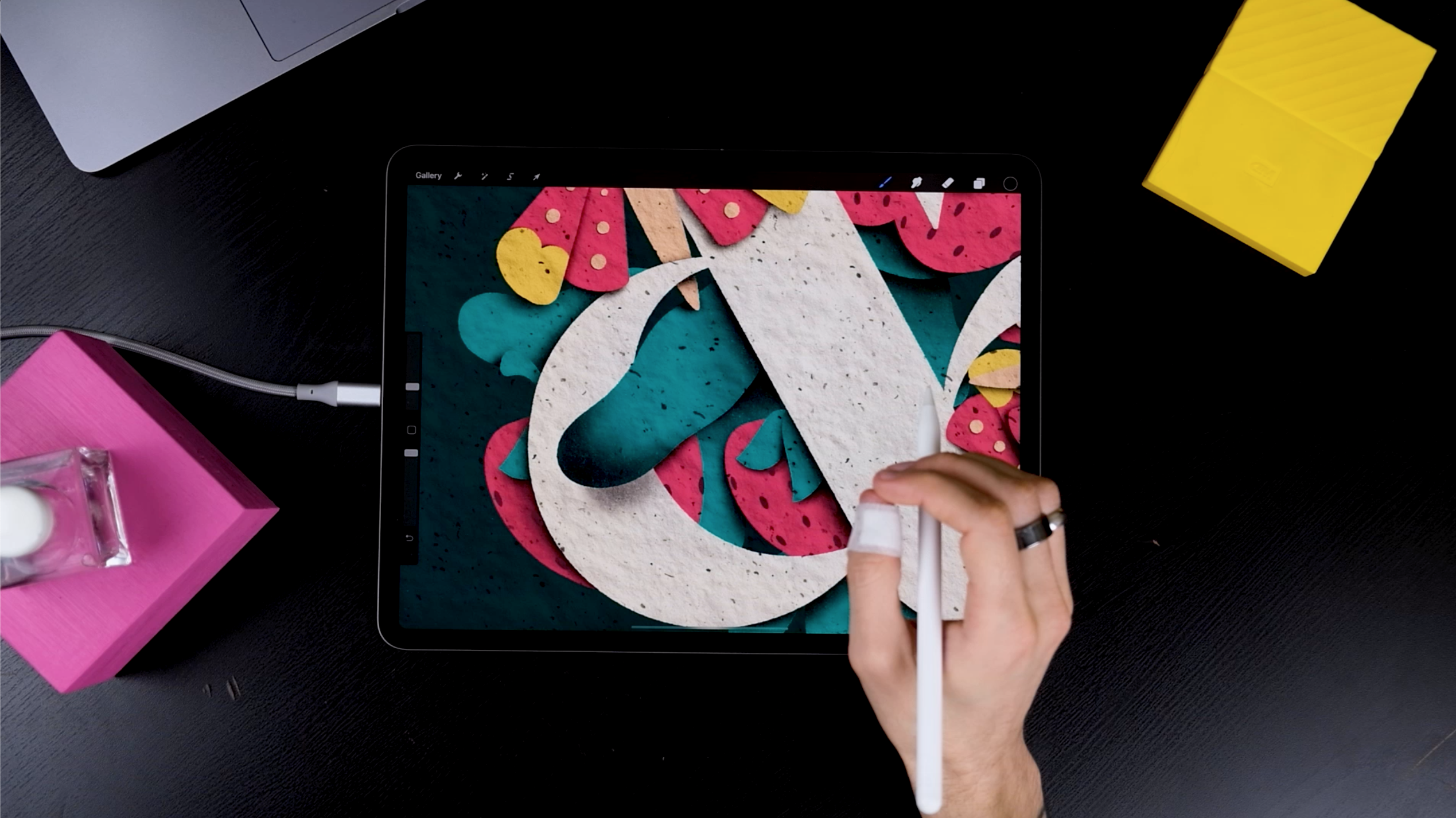
Before adding textures, make changes to colors if you like. In this tutorial, let’s switch the ampersand’s color with the background’s color.
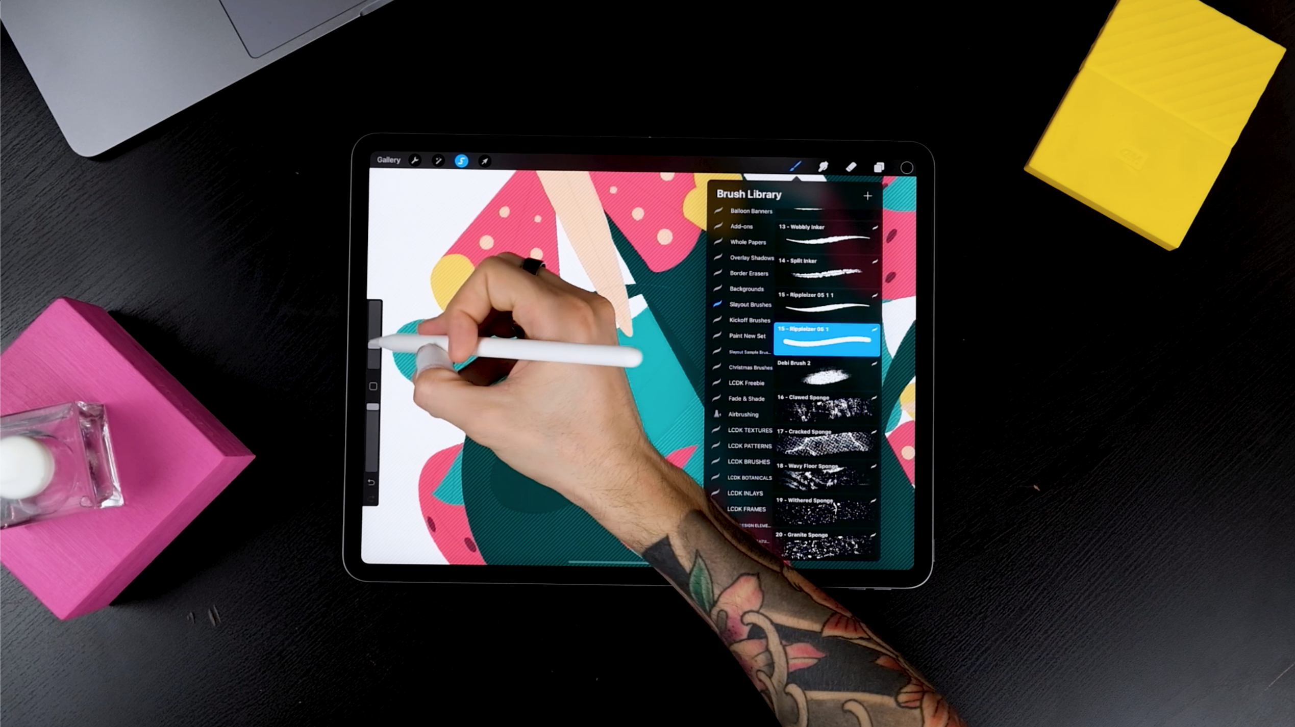
STEP 5: APPLY AN OVERALL TEXTURE
Add texture to make the piece more realistic.
- For the effect shown in the image below, choose one of the background textures from The Ultimate Procreate Background Set.
- Play around, choose different textures you like and just leave one texture turned on, you’ll see why later!
(PS. The names of the textures were updated after the tutorial was recorded.)
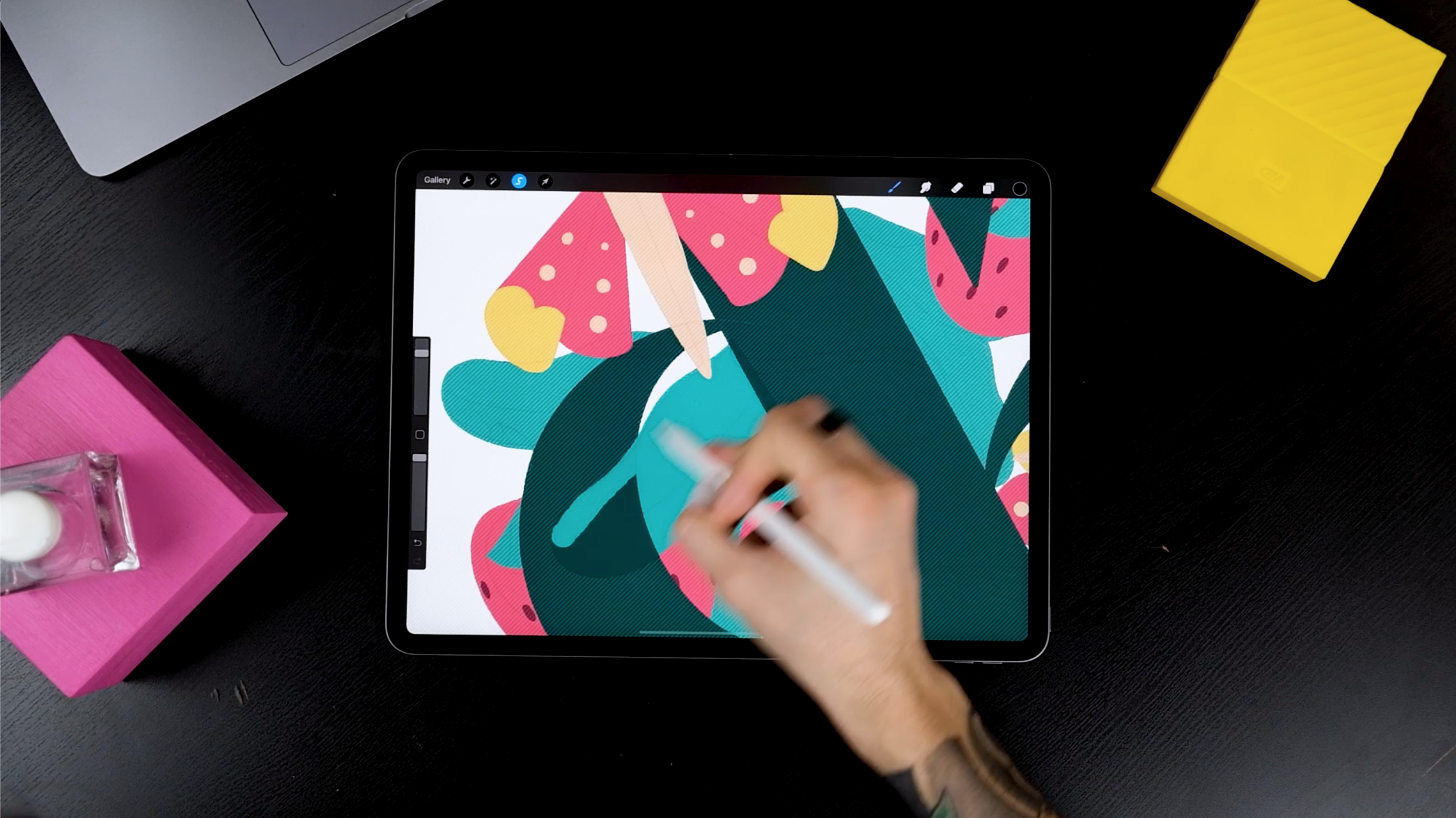
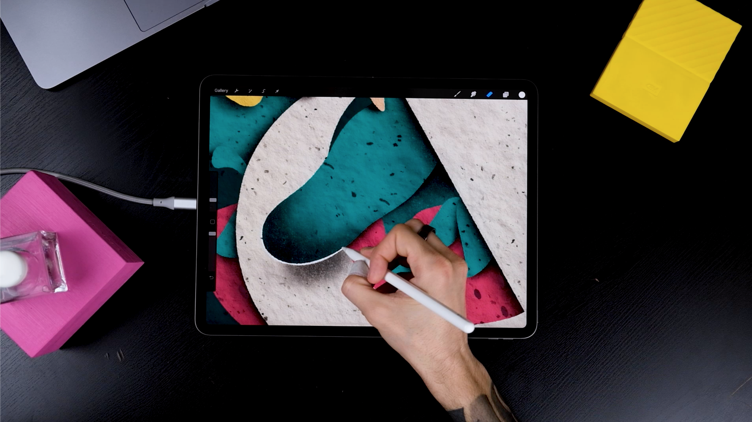
STEP 6: ADD SHADOWS
To add some shadows, choose a direction where the light source is coming from. For this tutorial, the light source is at the top right.
- Zoom into one of the elements, select the object, and choose a shader.
- Create a new layer on top and select the clipping mask.
- Using the inverted brushes from The Ultimate Procreate Background Set to add shadow using a darker tone. Repeat the same process in all the shapes.
Here’s a little tip: Don’t choose a 100% black tone for shading, play around with dark colors until you find the one that suits you best.
If you don’t have the brush set, try out the free brush sample from our Freebies or use a soft airbrush from Procreate’s native airbrushing panel.
Creating clipping masks if you have layers available. If you’re running out of layers, go to the layers and tap on Alpha Lock. This lets you create shadows on the same layer and save space. Remember, by doing this you’ll have less control and you won’t be able to erase your shadows later. So, stick with clipping masks if you have enough layers! Join the shapes with their clipping masks if you are running of layers. It’s risky but there’s nothing you can do at this point!
Next, duplicate the tiny elements. If you kept them in the same layer, grab the freehand selection tool, circle them, scroll three fingers down on the screen, and tap on duplicate.
- Now, bring them under the original layer
- Paint them in black and move them slightly to the bottom left.
- If you tap on the transform tool, you can move objects by tapping with your fingers towards the direction you want to move them to, always outside the selection though!
- Head to the Adjustments panel and tap on Gaussian blur. This allows you to scroll left and right on your screen to see what amount of blur looks better.
Now, everything looks semi-real already!
STEP 7: BEND THE PAPERS
If it was real paper, some cut shapes would bend a bit since we would work on it with our hands. So let’s try how to add this effect.
- Get one of the leaves
- Add a clipping mask on top and add some shadows like the ones I’m doing. If you’d bend it in real life it would generate these extra shadows (or similar ones anyway)
- Next, head to the ampersand’s clipping mask
- Add some shadows a bit further than the previous ones. The further you place them the more elevated the paper will look.
STEP 8: ADD LIGHTS IN CORNERS
Add some light by following these steps,
- Add some white borders on the paper as shown in the image below.
- Select the script or brush pen inside Procreate’s Calligraphy panel.
- Draw these lines on the left side of the shapes. Start thin, thicker at the middle and thinner at the end. Now repeat this in all the shapes.
Next, create the secondary lights,
- Create another layer on top of the lines you’ve just done.
- Select the Medium Brush inside the Airbrushing panel.
- Size it quite small and spray some blurred lines as shown in the image below.

STEP 9: ADD FINAL TEXTURES TO THE BACKGROUND
The illustration is done! Time to add final touch-ups in the background.
Go back to the gallery and duplicate the document. Since we will join all the illustration layers, it’s always better to keep a copy of the hard work you’ve done.
To join layers start combining in groups pinching with two fingers as shown in the image below. Sometimes merging a bunch of them at the same time can get messy, so make sure you combine clipping masks with the object beneath first and then you can go faster.

Your illustration is just one layer! Now, do you remember the overall paper texture you had? Tap on it and make it a clipping mask. Now, this texture belongs just to the illustration. We’ll play later with the second texture we saved previously.

- Now, do a drop shadow of our illustration. How?
- Duplicate the illustration layer, select the bottom one and go to the adjustments panel.
- Tap on Hue, Saturation, Brightness, and just bring the Brightness completely down.
- Get the transform tool and select Freeform.
- Move the layer to the bottom left. (following your light source)
- Go to adjustments, gaussian blur, and scroll left and right depending on how much blur you want.
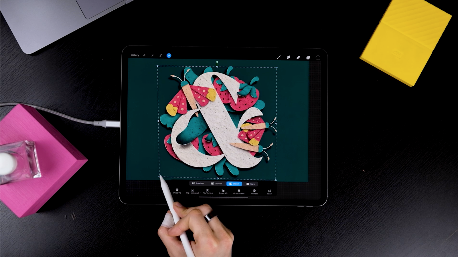
Next, add one of those not-too-obvious effects now. We don’t want the paper illustration to be sitting completely straight. So, select the transform tool again, tap on distort, and move the dot from the bottom left to the right. This will bring the shadow closer on one side and further on the other. It will look like it’s not sitting perfectly in the background and makes the illustration more realistic.
Now I’m setting this Layer to multiply by tapping on it in the layer’s panel. Bring the opacity down or up as you please.
Now head to that second background texture we saved before and bring it to the background. If you skipped that little step, feel free to add a new layer and spray a new texture. This will give 2 different textures to our piece (on your illustration and on the background) and will make the whole piece look more realistic.
Add a new layer, select a brighter color such as turquoise and spray some texture on the upper right side. Use an inverted brush from The Ultimate Procreate Background Set. Set this layer to Color Dodge, and you’re dooooone!

THE END!
We really hope you enjoyed this and that you made some beautiful illustrations. You can always leave a comment or reach out to us on Instagram @jimbobernaus if you want to leave feedback or tell us if you would like to learn something particular. We would love to help you out!
We wish you a spectacular day with a taste of creativity. And now - letter away!
Join our Newsletter Community, to get access to all of our freebies, including free Procreate Brushes, Textures, Fonts, and other fresh stuff!